meta data for this page
- en
This is an old revision of the document!
Understanding and Using Windows
- A comprehensive guide to the window layout element
This section explains the concept of windows within Total Launcher, detailing creation methods, property configuration, and practical applications for customized screen layouts.
What is a Window?
A window in Total Launcher operates as a pop-up or floating page. Unlike standard widgets or themes, a window is a dedicated layout container that exists above the primary background page. This architectural separation allows the main page to act as a fixed canvas, while windows serve as dynamic, floating layers that can be summoned and dismissed as needed.
Because a window functions similarly to a standard page, it can contain any combination of apps, widgets, text, and graphical objects. This makes windows ideal for constructing custom app drawers, pop-up menus, widget stacks, or floating control panels. A single window resource can be reused and triggered from any page within the launcher.
Anatomy and Core Properties
To customize a window's dimensions and placement, enter edit mode and select the window. Resizing is accomplished by long-pressing an empty area of the window and dragging the corners of the container to the desired scale. While in this resize mode, the options button provides access to structural and visual behaviors.
Modal vs. Non-modal Behavior
The interaction state of a window dictates how it affects the underlying page. Understanding these formats allows for better layout planning.
- Modal: - Blocks all interaction with the background page. The window must be dismissed before the main interface can be used.
- Benefits: - Focuses user attention entirely on a specific task, such as a full-screen app drawer, a configuration menu, or a search overlay. It temporarily removes visual clutter from the background.
- How to create: - This is the default behavior in Total Launcher. It is enforced globally when the
Launcher options>UI & Animation>Allow interaction behind windowtoggle is disabled in the launcher's UI & Animation settings. Modal behavior is also forced ifDim behindorBlur behindare enabled. To visually enforce a modal state, enableFull heightin the window options or apply a solidBackgroundcolor (e.g.,#FF000000) to completely obscure the background page.
- Non-modal: - Permits active interaction with the background page while the window remains visible on the screen. It operates as a persistent floating panel.
- Benefits: - Highly effective for persistent reference tools, such as floating media controls, sidebars, weather dashboards, or sticky notes. It keeps the main home screen context active and usable.
- How to create: - Navigate to
Launcher Options>UI & Animationand enable the toggle forAllow interaction behind window. Note that this setting will be ignored ifBlur behindorDim behindare active in the same menu. For a persistent non-modal experience, resize the window container so it occupies only a small portion of the screen, and enableIgnore Backin the window settings to prevent system navigation from dismissing it.
Accessing Window Settings
To configure a window or folder, follow the standard editing procedure:
- Enter edit mode on the launcher home screen.
- Select the target window or folder element.
- Select the gear icon

- Navigate to the
OPTIONSorANIMATIONtabs at the bottom of the screen to modify specific behaviors.

Window Options Configuration
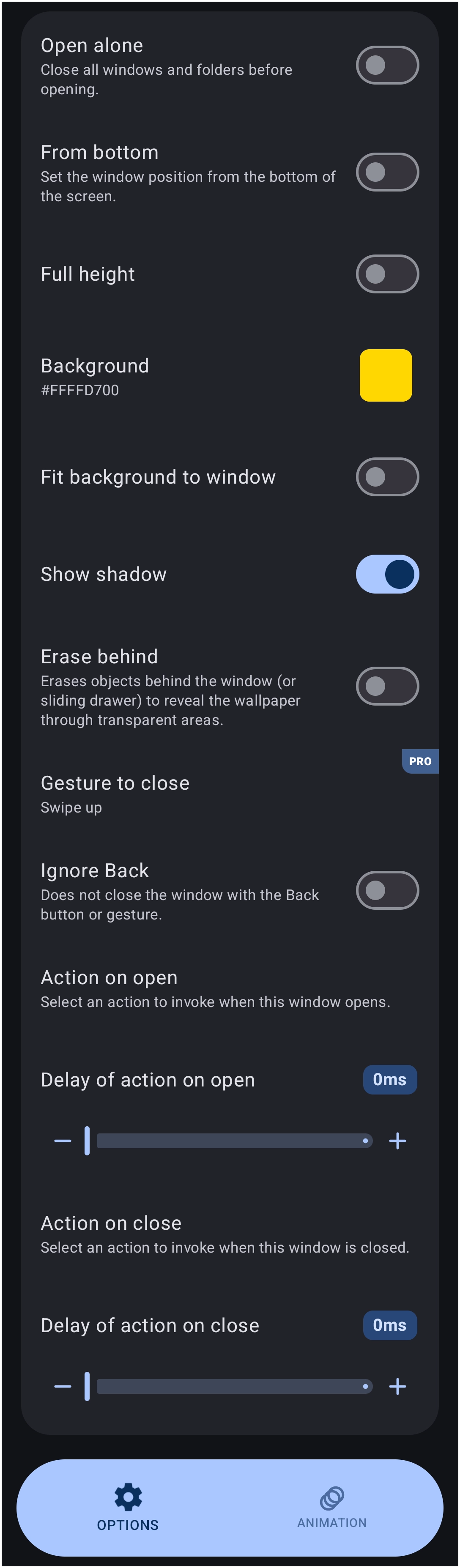
This topic covers the customization settings available for windows and folders to alter their behavior, appearance, and automation. The Window Options menu provides extensive control over pop-up windows within the launcher environment. Configuring these settings allows for a highly tailored user interface, improving device navigation, aesthetic cohesion, and functional automation.
Display and Layout Settings
These options dictate the physical appearance and screen positioning of the window.
- Open alone: - Closes all currently active windows and folders before opening the selected one. Maintains a clutter-free workspace and focuses the display on a single interface.
- From bottom: - Sets the window position to originate from the bottom of the screen. Facilitates the creation of modern bottom-sheet menus that are easily reachable for one-handed operation.
- Full height: - Expands the window to occupy the entire vertical space of the screen. Used to create comprehensive app drawers or immersive custom dashboards. If
From bottomis also enabled, it stretches the window to touch the top of the screen. - Background: - Defines the background color, Dynamic color, Icon pack, Shape, Image, or Dynamic image for the window container. Here, color is represented by a hex value (e.g.,
#FFCCCCCC). Used to match the overall theme design of the launcher layout. - Fit background to window: - Adjusts the assigned background image or color to fit exactly within the window boundaries, preventing visual overflow. When disabled, the image is cropped to fit while maintaining its original proportions.
- Show shadow: - Applies a drop shadow effect around the exterior of the window. This adds visual depth and separates the active window from the underlying graphical elements.
- Erase behind: - Erases objects located behind the window or sliding drawer to reveal the system wallpaper through transparent areas. Allows for complex layering effects or custom mask cutouts.
Interaction and Gestures
These settings modify how the window responds to touch inputs and system navigation commands.
- Gesture to close: - Configures a specific touch gesture, such as
Swipe up, to close the window. Provides fast, fluid navigation without requiring precise taps on a dedicated close button. Note that this requires aPROlicense. - Ignore Back: - Prevents the window from being closed using the system Back button or system navigation gesture. Used to create persistent on-screen displays, mandatory menus, or kiosk-style locked interfaces.
Automation and Actions
Automated actions can be triggered based on the window's lifecycle state.
- Action on open: - Selects an action to invoke automatically when the window opens. Used to launch supplementary applications, change system settings, or trigger shortcut tasks simultaneously with the window launch.
- Delay of action on open: - Configures a specific delay, represented in milliseconds such as
0ms, before the open action triggers. Allows for sequencing entrance animations before a secondary action occurs. - Action on close: - Selects an action to invoke automatically when the window is closed. Performs cleanup tasks or returns system settings to a previous state upon window dismissal.
- Delay of action on close: - Configures a delay, represented in milliseconds such as
0ms, before the close action triggers.
Creating and Designing a Window
The creation process requires generating a new window resource and populating it with content:
- Enter Edit mode on the launcher home screen.
- Navigate to the launcher menu, select
Launcher options, thenResources, and finallyWindows. - Select the
+icon to generate and name the new window layout (avoiding spaces in the name). - Locate the newly created window in the list and select its action icon to open it.
- With the empty window open, use the
+icon in the object menu to add elements such as App Groups, Widgets, or graphics.
- Reference: - Consult the detailed guide at How To Create A Simple Window for visual examples.
Triggers and Animations
A window can be activated from any location on the screen using a shortcut or a gesture. Total Launcher also supports opening windows via shortcuts triggered by third-party applications.
Opening and Closing Methods
- Opening Triggers: - Assign the “Open Window” action to a graphic object (tap action), a screen swipe gesture, or a hardware button.
- Closing Behaviors: - Windows can be dismissed by tapping outside the window boundaries, utilizing the
Gesture to closesetting, or by creating a dedicated 'Close' button inside the window layout assigned to the “Close Window” action.
Window Animation Configuration
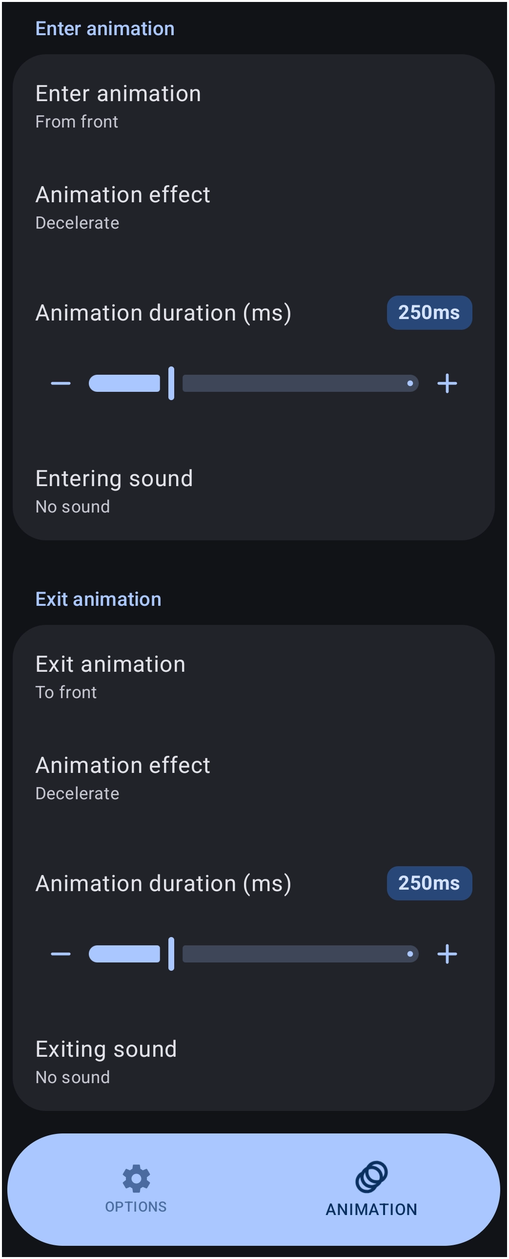
The Animation dialog controls the visual transition when a window appears or disappears:
- Enter animation: - Defines the entrance style (e.g.,
From front). - Animation effect: - Modifies the easing curve for the entrance motion, such as
Decelerate. - Animation duration (ms): - Dictates the speed of the entrance transition in milliseconds (e.g.,
250ms). - Entering sound: - Triggers an audio file upon opening (e.g.,
No sound). - Exit animation: - Defines the dismissal style (e.g.,
To front). - Animation effect: - Modifies the easing curve for the exit motion.
- Animation duration (ms): - Dictates the speed of the exit transition.
- Exiting sound: - Triggers an audio file upon closing.
Practical Use Cases
Windows enable complex organizational structures without cluttering the main page:
- Pop-up App Drawers: - Place an App Group widget inside a window to create a custom, floating app drawer that can be summoned with a swipe gesture.
- Widget Stacking: - Layer multiple widgets within a single window to create a compact, scrollable information hub.
- Custom Search Backgrounds: - Enclose a search widget inside a window to apply custom background images and styling to the search interface.
Advanced Window Management
While windows serve as functional layout containers out of the box, integrating them with variables and automated actions unlocks highly dynamic behaviors.
Passing Variables
Variables permit a single window design to display completely different text or imagery depending on what action opened it. This reduces the need to build numerous identical windows.
- The Concept: - Rather than creating multiple separate windows for different notifications, create one master window template. An external tool passes data into the launcher, updating the template before the window appears.
- Implementation: - Insert a text object inside the window and format its text to call a launcher variable using angular brackets (e.g.,
<notification_text>). The angular bracket format (<name>) is a native Total Launcher syntax requirement; it instructs the launcher to evaluate the string as a dynamic variable rather than rendering it as literal text. Utilize automation apps like Tasker or MacroDroid via the Total Launcher plugin to push updated text to the target variable. Note that when configuring the target variable name within the automation app's plugin interface, the angular brackets must be omitted (e.g., entered only asnotification_text). Following the variable update, the automation app triggers the window to open, displaying the freshly injected data.
Chaining Windows
Sequential window flows can be created, allowing one interface to seamlessly transform into another without manual intervention.
- The Concept: - The dismissal or appearance of one window automatically triggers a secondary window action.
- Implementation: - Navigate to the Window Options of the initial window. Locate the
Action on closesetting and assign it to the launcher actionOpen window. Select the secondary window as the target. When the user dismisses the first window, the secondary window instantly appears, creating an interconnected menu system.
Discussion