meta data for this page
Total Launcher Gestures Guide: Global Triggers, Invisible Hotspots, and Advanced Homescreen Navigation
Gestures in Total Launcher provide a highly effective way to execute system commands and manipulate custom Android homescreen layouts without relying on visible buttons. By using standard screen swipes, multi-touch inputs, and device sensor triggers, minimalist layouts become easy to achieve by making complex interactions invisible. The system divides these configuration options into global commands applied across the entire interface and object-specific triggers attached directly to individual icons or widgets. Implementing these advanced navigation mechanics maximizes screen real estate while streamlining interface control.
Navigate to begin configuring these invisible inputs:
Edit mode>Launcher Options>Key & Gestures.
Introduction to Gestures
Total Launcher supports a wide array of inputs, including standard swipes, multi-touch interactions, and device sensor triggers (shaking or flipping the device). Configuring these allows for a minimalist design by hiding complex functionality behind invisible triggers.
Keys & Gesture Dialog
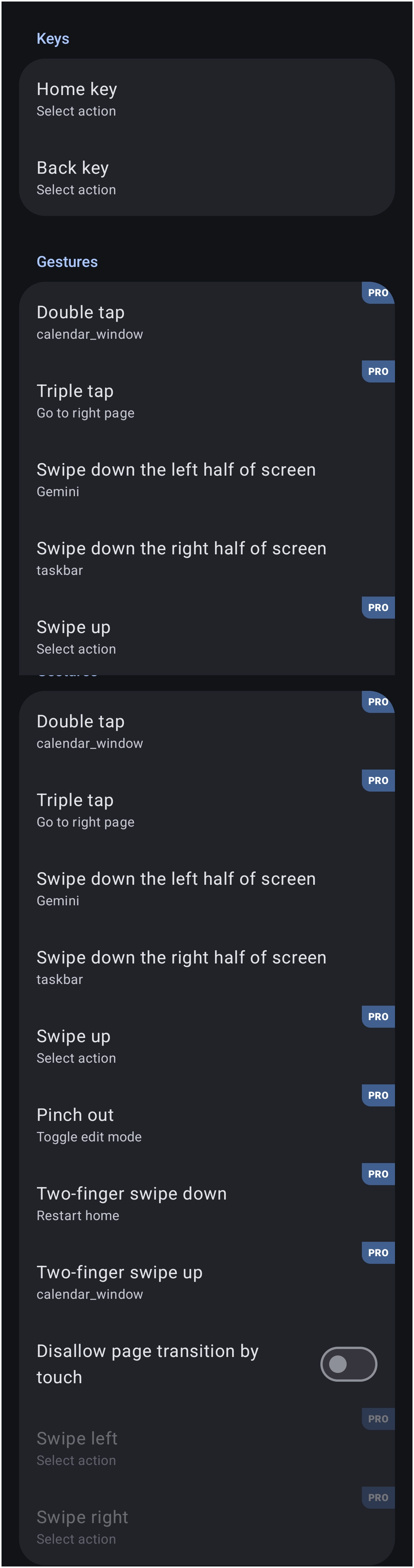
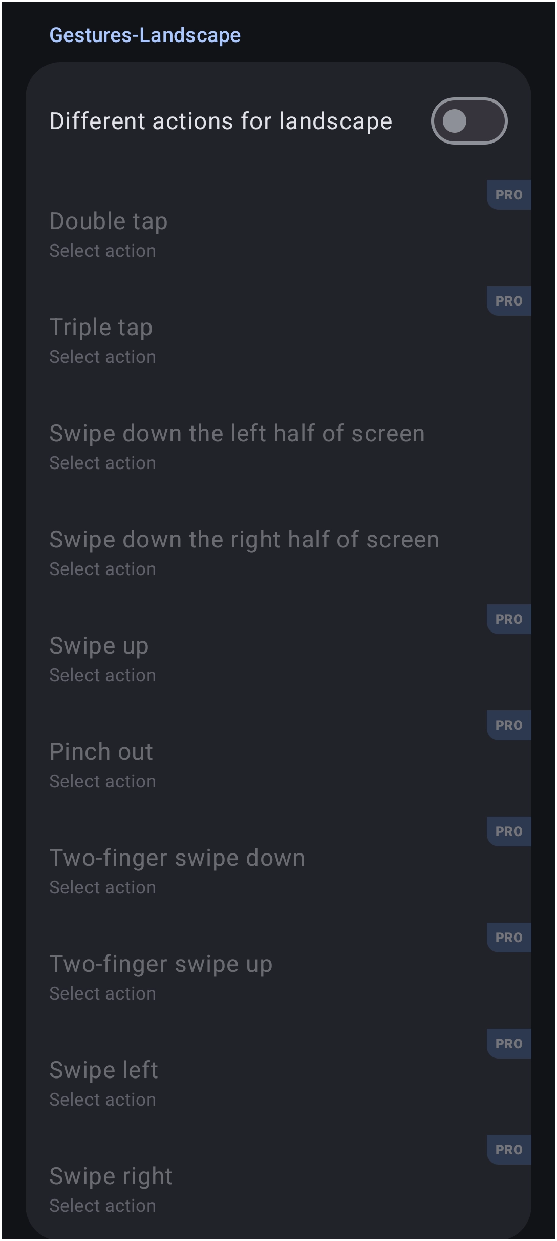
The Launcher option dialog for Keys & Gestures is shown below, in 3 segmented images:
| Keys & Gestures Dialog 1 of 3 | Keys & Gestures Dialog 2 of 3 | Keys & Gestures Dialog 3 of 3 |
|---|---|---|
 |  |  |
Global Gestures
Global gestures are detected on the background of the launcher (empty space) and are not tied to specific objects. These are managed within the main launcher settings.
The Key & Gestures menu separates inputs into standard touch gestures, landscape-specific overrides, and sensor-based actions.
| Keys & Gesture Input | Description |
|---|---|
| Home key | For devices using Android's “Back-Home-Recent Apps” navigation controls the command can be re-assigned. The Android operating system does not allow third-party launchers to override the input of the Recent Apps button directly. However, any gesture can be assigned by launcher action “Recent Apps” |
| Back key | |
| Double tap | Executes a command upon quickly tapping the screen background twice. |
| Triple tap | Executes a command upon quickly tapping the screen background three times. |
| Swipe down (Left half / Right half) | Distinct actions can be assigned to swiping down on the left half versus the right half of the screen. |
| Swipe up | Triggers an action when swiping upward on an empty area. |
| Pinch out | Typically used to toggle Edit mode or open menus. |
| Two-finger swipe (Up/Down) | Supports directional swipes using two fingers simultaneously. |
| Swipe (Left/Right) | RequiresDisallow page transition by touch to be turned on. |
| Face down | Executes an action when the device is placed screen-down on a flat surface. |
| Face up | Executes an action when the device is placed screen-up. |
| Shake device | Triggers an action when the device is shaken. Includes a Shake sensitivity setting. |
Landscape Mode
The Gestures Landscape section allows for a distinct set of actions when the device is rotated.
- Different actions for landscape: - Enabling this toggle allows the user to assign unique actions to the gestures listed above when the device is in landscape orientation.
Advanced Settings
Additional configuration options are available at the bottom of the Key & Gestures menu.
- Gesture animation: - Toggles the visual feedback when a gesture is recognized.
- Gesture vibration: - Toggles haptic feedback when a gesture is executed.
- Disable long-press background: - Prevents the long-press action from opening the launcher menu. Note that the menu can still be accessed via the
Pinch outgesture (orPinch independing on configuration) even if this is enabled.
Launcher Action Alternatives
Gestures are generally global in nature. Look at Total Launcher's "Launcher Actions" as an alternative to accomplishing object-specific actions.
Object-Specific Gestures
Gestures can also be assigned to individual objects, such as app icons, graphic images, or text. This allows a single object to perform multiple functions.
- Configuration: - Select an object in
Edit mode, then navigate to the object's Action menu .
 - Swipe Actions: - Determines what happens when the user swipes directly on the specific object.
- Direction: - Directions for object swipes are generally limited to the four cardinal directions (Up, Down, Left, Right) relative to the object.

Examples of object-specific configurations:
- Folder Emulation: - Tapping an icon opens the app; swiping up on the same icon opens a folder. For example, tapping opens a Finance folder containing all financial-related apps, while swiping left opens ABC Bank and swiping right opens the primary credit card.
- Widget Control: - Swiping on a music widget changes the media volume.
Layout Strategies
For theme designers, gestures offer a way to maintain a clean aesthetic while retaining complex functionality. Advanced implementations often involve invisible objects or “hotspots.”
- Invisible Hotspots: - Places a transparent
Graphicobject (opacity set to 0) over a specific area of the wallpaper. - Layering (Z-Index): - Ensures the invisible object intercepts touch events by placing it above other elements. This is achieved by selecting the object in
Edit modeand using the “Bring to front” or “Order” commands to move it to the top layer. - Action Assignment: - Assigns a
TaporSwipeaction to this invisible object to trigger the desired command.
This technique is useful for:
- Stealth Navigation: - Creating secret tap zones to reveal hidden windows.
- Custom Controls: - Overlaying gesture areas on top of static wallpapers to simulate interactive buttons.
- Conflict Resolution: - If a widget has internal touch controls that conflict with a global swipe gesture, placing a container or invisible object on top can manage how the touch is intercepted.
Note: When Edit mode is active, some gestures may be disabled or modified to allow for object selection and movement. Testing should always be performed in Use mode.
Comments & Feedback
Toby Lancer is ready to help! Look for the Quick Help form:
► Desktop: left sidebar located near the bottom for Private to Admin
► Mobile: 3-bar menu at page top.
► Use the Discussion section below to share any experiences and communications with other Total Launcher users.
► Any Registered User can directly update this and any wiki page if desired.
Moderation: To keep the manual clean, all comments are held for appropriateness review. Preview any comment before submitting it. It will not be displayed after submission until it is reviewed. So, please, do not resubmit.
Formatting: If using any code snippets, place them inside code tags (e.g., 'code') using double single quotes (') before and after to keep them readable.
Be Kind: This is a community effort. Please keep feedback constructive and on topic.
~~DISCUSSION~~