meta data for this page
Total Launcher Sliding Drawer: Configuring Off-Screen App Shelves and Panels
The Sliding Drawer in Total Launcher provides a built-in, off-screen workspace attached directly to any screen edge. Functioning similarly to a native notification shade, this hidden panel expands inward via edge gestures to expose user-defined app grids, widgets, and custom shortcuts without cluttering the primary homescreen canvas. Because the launcher automatically handles panel creation and gesture mapping upon activation, deploying a sliding drawer offers an immediate solution for building hidden widget shelves or custom app drawers. The following guide details the setup procedure, interface advantages, and edge-gesture priority rules.
| Sliding Drawer Interface Preview | ||
|---|---|---|
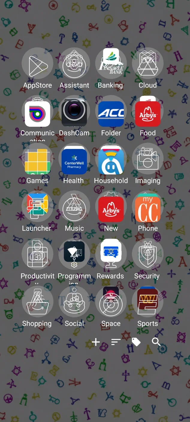 | ☛ The Sliding Drawer is a built-in workspace hidden off-screen. Demo ☛ |  |
It is a distinct screen area attached to the Left, Right, Top, or Bottom edge of the display. While it could be considered a “window” (another feature of Total Launcher which would have to be built from scratch), the Sliding Drawer is a system feature which is simply “turned on,” and the launcher handles its creation. It populates automatically with all device apps (similar to the App drawer widget.
It works exactly like the “Notification Shade” on the device, but can be placed in 4 different locations and contain user-selected widgets, apps, and folders.
How to Enable
- Choose
On the left(or ..right/..top/..bottom) - Exit the menu. A swipe from that edge opens the new drawer with all device apps.
Practical Interface Solutions
Enabling a Sliding Drawer solves common layout challenges by keeping secondary elements accessible yet hidden:
- Custom “All Apps” Panel:
- Instead of crowding the main workspace with app icons, enable the Bottom Sliding Drawer and place an App Drawer object inside. This replicates the standard “Swipe up for apps” interaction while allowing total control over grid sizing and background styling.
- The Hidden Widget Shelf:
- Place large, information-dense widgets (such as calendars, weather graphs, or music controllers) inside a Left Sliding Drawer. They remain accessible with a single swipe without obscuring desktop wallpapers.
- Extended Dock Replacement:
- Replace a restrictive 5-icon static dock with a sliding drawer containing multiple rows of favorite applications, Tasker shortcuts, or contact cards.
Important Technical Rules
- Edge Priority:
- The Sliding Drawer overrides standard page gestures along the extreme screen boundary. For example, enabling a Left Sliding Drawer takes priority over a global “Swipe Right” page gesture when initiated from the outer bezel edge.
- Independent Grid Geometry:
- Each drawer operates as an independent container with its own grid configuration. A sparse 4×4 layout can be maintained on the main homescreen page while utilizing a dense 6×10 grid inside the drawer.
- Button and Gesture Triggers:
- In addition to edge swipes, drawers can be toggled remotely by assigning a Launcher Action (e.g., `Open [Direction] drawer`) to any graphic button, icon, or double-tap gesture.
System Gesture Tip: If edge swipes conflict with Android gesture navigation (such as the system “Back” gesture on the left or right screen border), consider utilizing a Top or Bottom sliding drawer, or trigger the drawer exclusively via a Launcher Action assigned to a button. The Launcher also offers a Widget: Drawer handle, a default `chevron` that can be modified to rest in the screen edge area.
Related Concepts
More Information
Additional discussion can be found here in the wiki's “ui” section.
Comments & Feedback
Toby Lancer is ready to help! Look for the Quick Help form:
► Desktop: left sidebar located near the bottom for Private to Admin
► Mobile: 3-bar menu at page top.
► Use the Discussion section below to share any experiences and communications with other Total Launcher users.
► Any Registered User can directly update this and any wiki page if desired.
Moderation: To keep the manual clean, all comments are held for appropriateness review. Preview any comment before submitting it. It will not be displayed after submission until it is reviewed. So, please, do not resubmit.
Formatting: If using any code snippets, place them inside code tags (e.g., 'code') using double single quotes (') before and after to keep them readable.
Be Kind: This is a community effort. Please keep feedback constructive and on topic.
~~DISCUSSION~~