meta data for this page
App Reminders from the Developer ChYK
After initially installing Total Launcher, the developer, ChYK, has programmed pop-up reminders that offer mindful tips on how to best work within the Total Launcher system. Every user should have seen these, but uiTLM and this wiki will use this page as a reminder of the reminders.
↓ Tap the image to view it full size ↓
Welcome To Editing
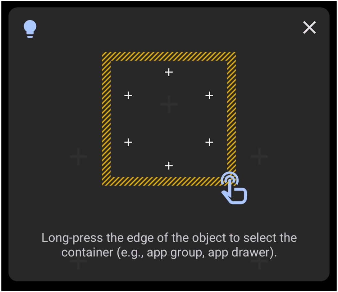
Call this a “Pressing Welcome!
As the first tip after the Total Launcher installation, the master tip is introduced. Press to edit is the default at installation but can be changed in Launcher Options. As it stands at installation:
☛ Long-press the background
☛ Pinch-in on the screen
☛ Press the menu edit icon
Use the Menu key in the lower right, which initially shows  , when pressed changes to
Backup
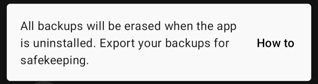
This is a CAUTION … anytime Total Launcher is deleted or re-installed, the existing Resource backups will not survive. Solution - Export a backup to another device folder outside of Total Launcher, or better, Export to a cloud location (such as Google Drive or OneDrive). See Export a Backup for more information.
Editing: Dynamic Image
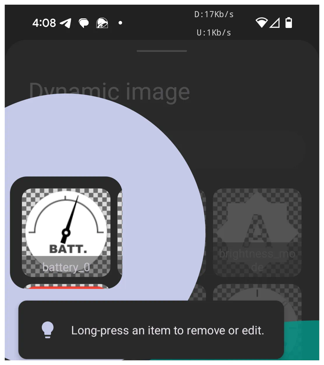
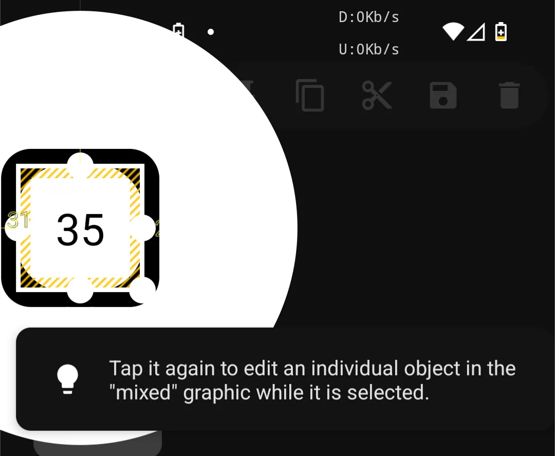
Two reminders are presented on this topic.
A dynamic object can be multiple objects grouped. This is also termed a mixed graphic if no dynamic elements are included. Long-press to enable editing and modify its objects via the Options icon. Or another tap will reveal the Edit icons 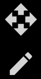 to move or set size/finite position.
Editing: Folder or Window
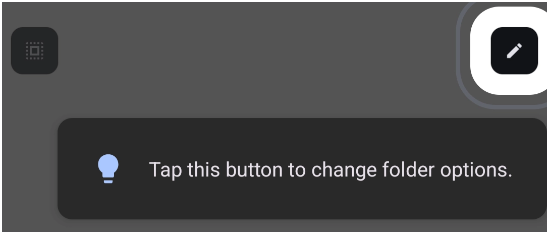
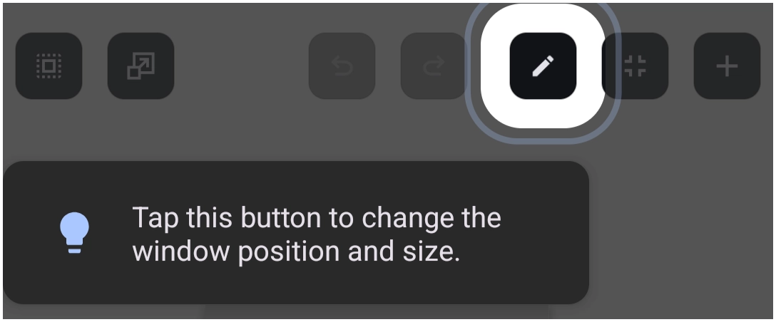
When in Edit On mode, and wishing to edit a folder or a window, look for the edit icon  in the Object Design menu at the top of the screen. This will open the necessary Edit dialog for making modifications.
Editing: Object Move
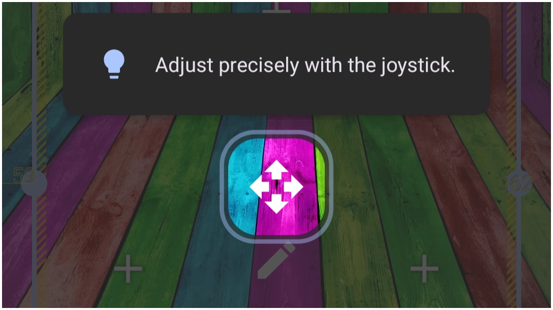
When in Edit On mode and an object is selected, the Move icon  is displayed.
This tip refers to the icon as “joystick”, but the uiTLM wiki uses the terminology move.
While the icon appears, dragging it will provide more definitive positioning of the selected object. But be fast; it disappears quickly. Just select the object again and grab it fast.
Another similar icon 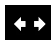 appears if the object boundary (right side) is tapped. The direction of the arrows indicates the movement is horizontal (left/right) only, but that applies to the size of the object boundary. Best used if the object is “text”. If “graphic”, it will distort.
Finally, an edit option icon 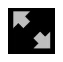 can appear if the object boundary (bottom right corner) is tapped. The diagonal direction will alter the size of the object's boundary, but it is proportional. Good for images and text-based objects.
Object Design Menu: Action
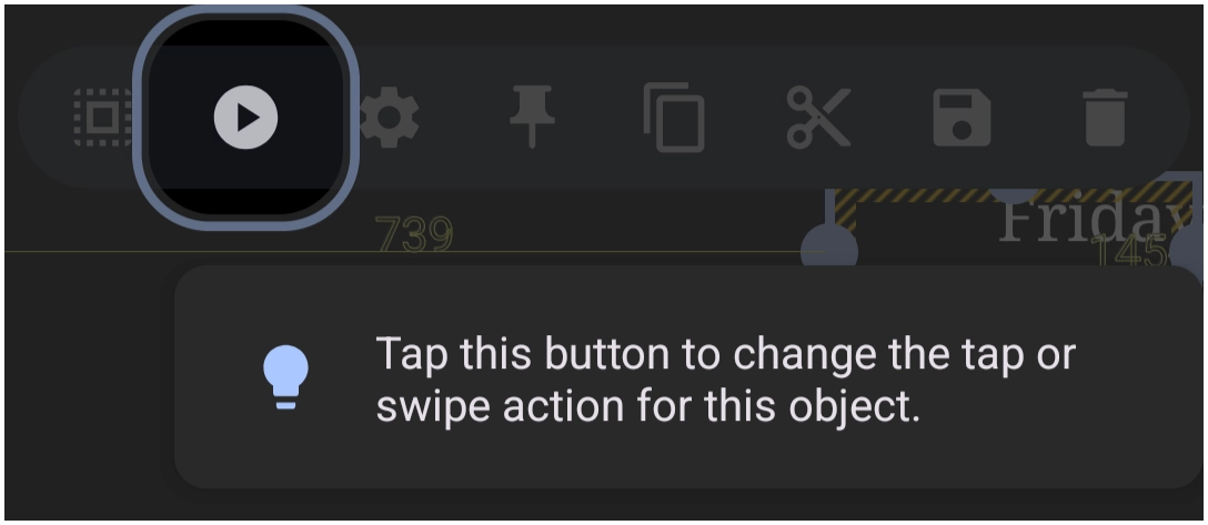
When in Edit On mode, the menu bar at the top of the screen has an Action icon  . This opens the dialog to select what the object (icon, folder, window, etc.) will do when tapped, swiped left (right, up, or down). This is the first action, which will lead to a second one (such as opening a specific app, folder, or internet site URL).
Object Design Menu: Add
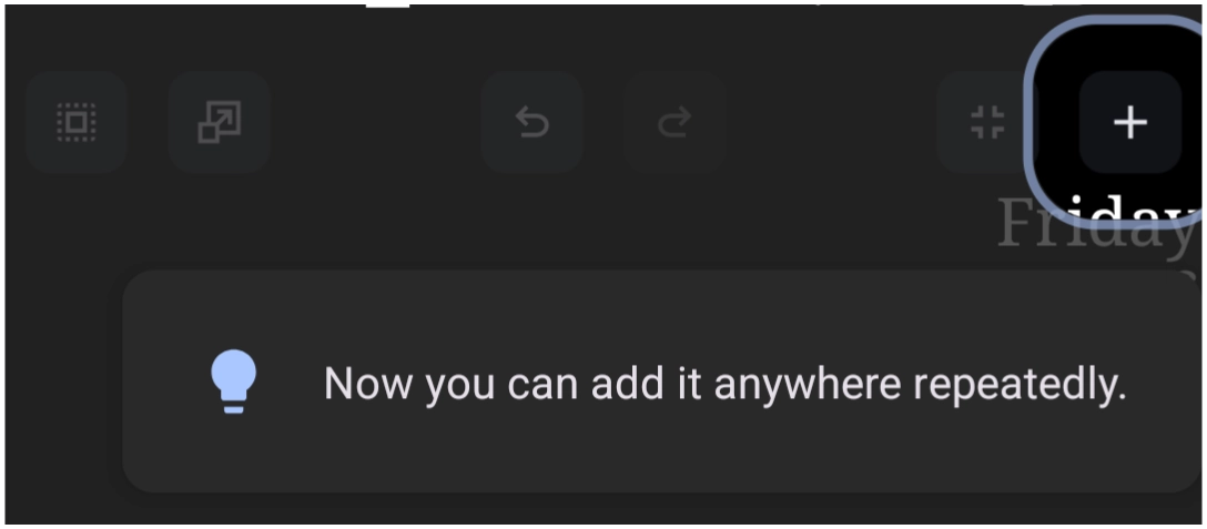
When in Edit On mode, the menu bar at the top of the screen has an Add icon  . Tap this icon to select the layout, widget, or graphic to add to the page and begin the design journey. See "How to Create a Simple Window and Add an Object".
Object Design Menu: Group
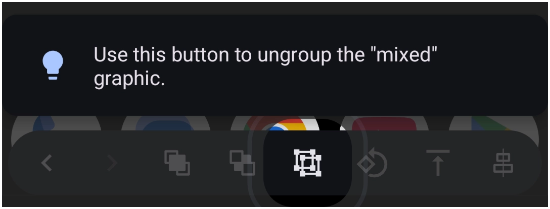
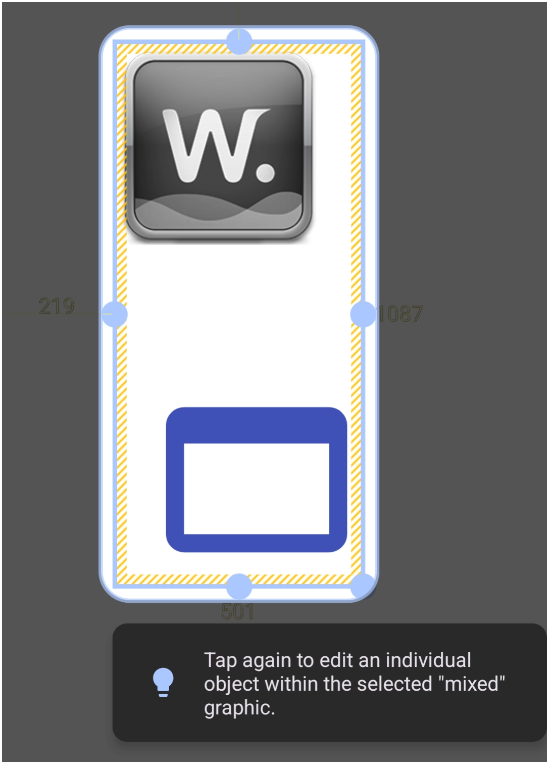
When in Edit On mode, the menu bar at the bottom of the screen has a Group icon  . This will cause selected individual objects (highlighted by a selection border) to be treated as a single object when this icon is tapped. The multiple items must be previously and actively selected to be grouped as one. This is beneficial when relocating or saving a design multi-part object. However, editing any object within the group will require the “group” to be “ungrouped”.
Object Design Menu: Navigation
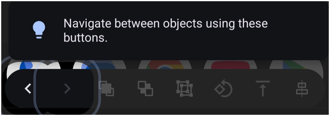
A layout contains many objects; some are difficult to select. Frequently, the solution is to select a single object which enables the Object Design Menus (top and bottom) to be viewable. The navigation icons  or
or  (sometimes thought of as a selection tool) are displayed, and tapping will cycle through the layout's collection, either forward or backward, based on the order each was added to the layout.
Object Design Menu: Option
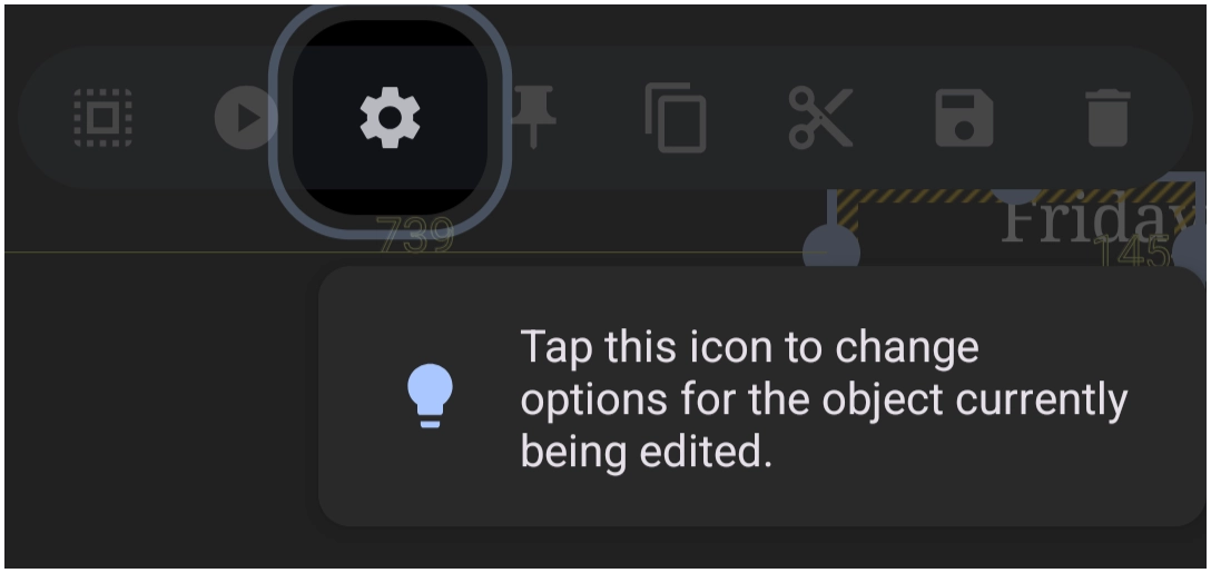
When in Edit On mode, the menu bar at the top of the screen has an Option icon  which opens a dialog to modify the content and visual display characteristics of the selected object.
Object Design Menu: Paste
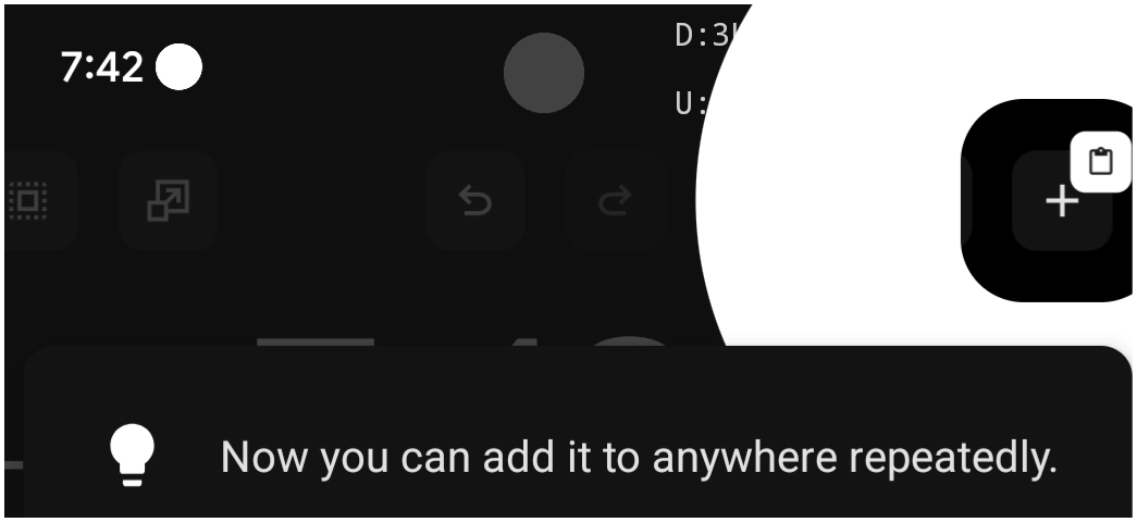
When in Edit On mode, the menu bar at the top of the screen has a Copy icon  which copies the selected object. After copying, the menu bar shows the “Paste” icon
  which will insert the copied object onto the page.
Object Design Menu: Pin
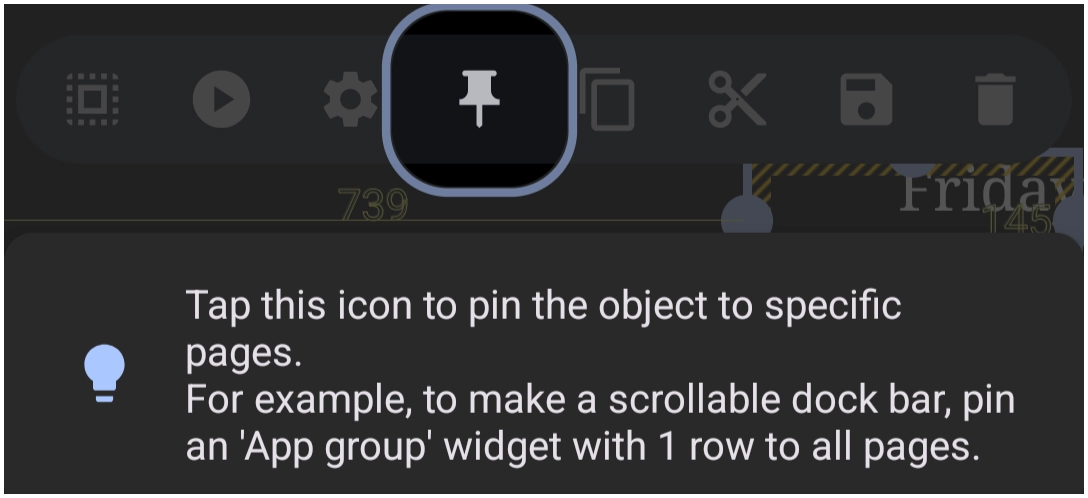
When in Edit On mode, the menu bar at the top of the screen has a Pin icon  which will cause the currently selected object and its position to appear on all pages of the setup. As the tip suggests, it is an excellent way to place an app dock (1 or 2 rows) at the bottom of each page for easy app access. There are many other uses for this feature, including providing consistency between pages when designing a multi-page setup.
Object Design Menu: Save
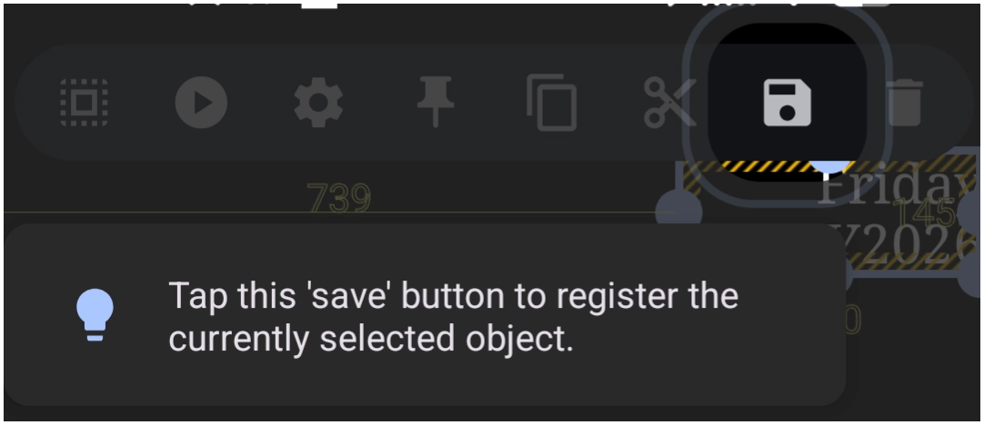
When in Edit On mode, the menu bar at the top of the screen has a Save icon  , which, when tapped, will place the selected object in Total Launcher Resources as an object that can later be reused. The “saved” objects can be accessed by the Object Design Menu (top) >
 Add > (select either layout, widget, or graphic) > Saved.
Object & Page Design Menus: Select
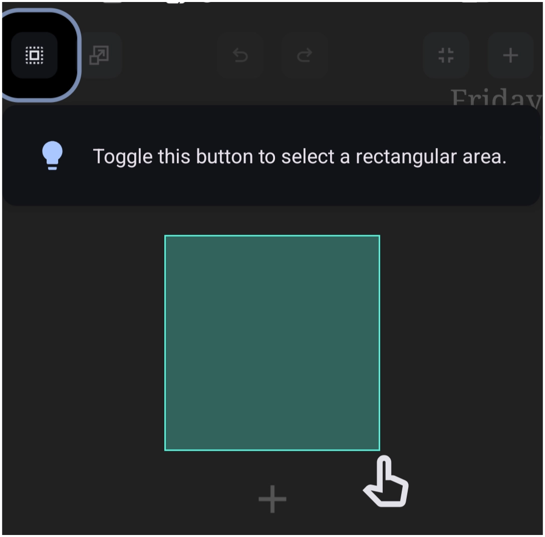
When in Edit On mode, the menu bar at the top of the screen has a Select icon  which makes selecting (highlighting) an object or multiple objects very easy. There are two modes available after tapping the icon:
- Drag right-to-left: This will select only those objects which are completely within the created drag boundary.
- Drag left-to-right: This selects any object(s) which are partially within the created drag boundary.
Permission - Accessibility & Open Recent Apps
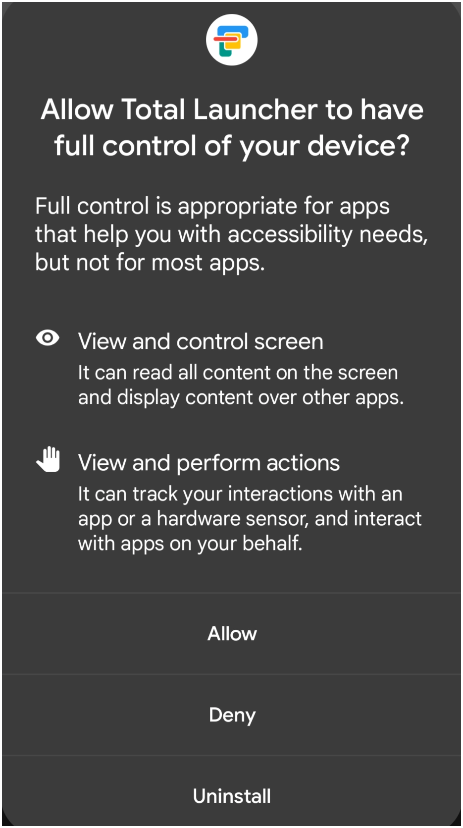
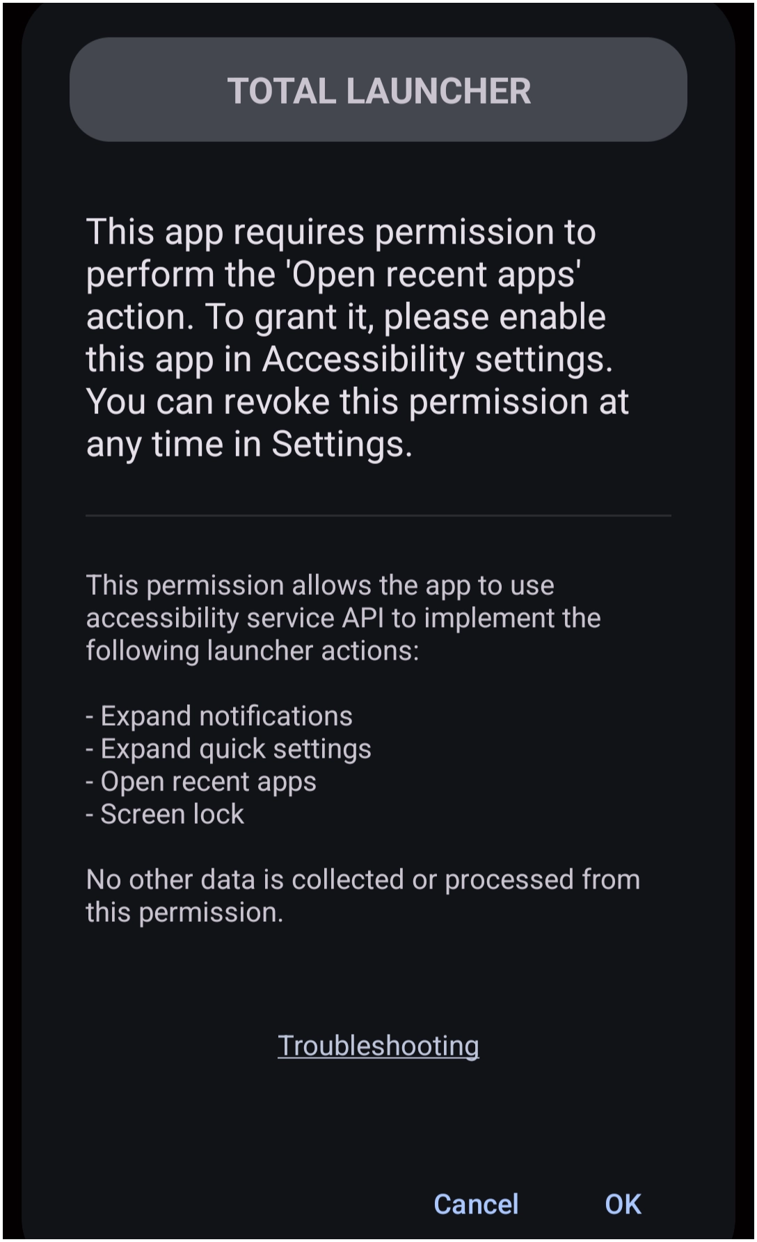
The device's Android OS requires user permissions for the Launcher to perform specific features. While the user may deny a request, the Launcher may not then perform as expected. See Permissions For New Installs for more information.
Permission: Dynamic Text
Image Missing
Text which changes based on a system resource (RAM, storage, weather, etc.) or external data (using Tasker or MacroDroid to receive geolocation, weather data) requires an Android device permission. Total Launcher will show a notification if that permission has not been granted.
Resources - Delete

The Launcher's Resource areas are where it stores images, shapes, windows, dynamic images, shadows, typefaces, sounds, and sequences. To use these types of objects, they must be “imported” into the appropriate resource. See Understanding Resources.
Over time, the user may wish to remove unused items. The “tap & hold” will open a delete icon  in the dialog.
Sequence
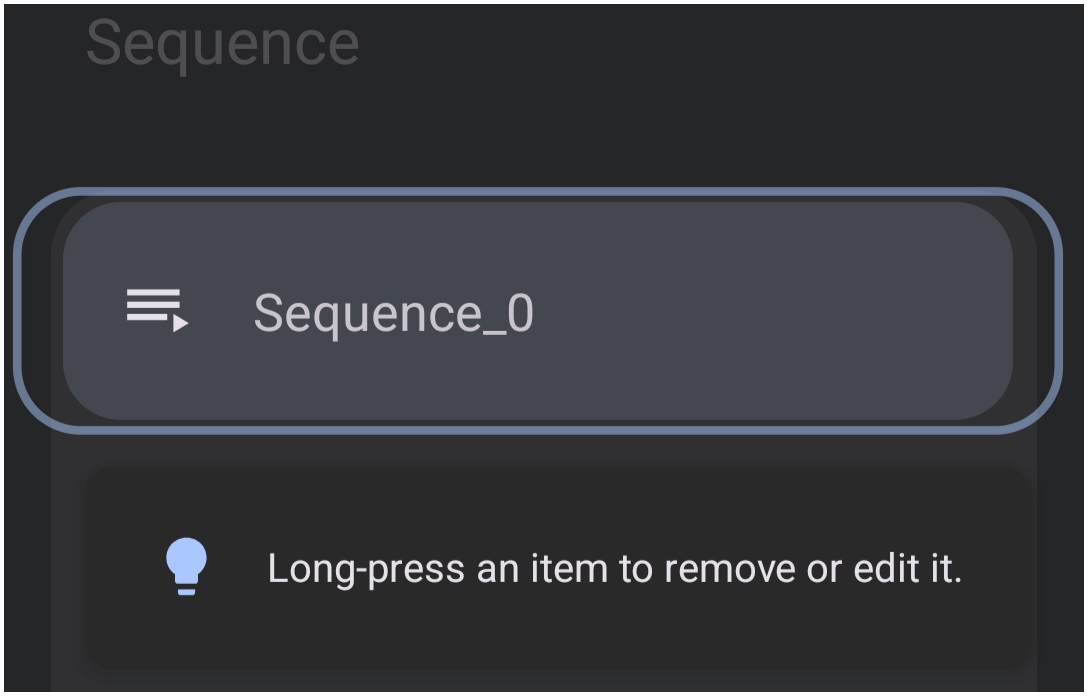
A sequence is a Resource and is similar to a macro … a series of actions associated with an object. Launcher sequences are listed in a Resource dialog. The Delete icon is hidden until the listing element is pressed to select. The delete icon then appears, enabling removal.
Comments & Feedback
Toby Lancer is ready to help! Look for the Quick Help form:
► Desktop: left sidebar located near the bottom for Private to Admin
► Mobile: 3-bar menu at page top.
► Use the Discussion section below to share any experiences and communications with other Total Launcher users.
► Any Registered User can directly update this and any wiki page if desired.
Moderation: To keep the manual clean, all comments are held for appropriateness review. Preview any comment before submitting it. It will not be displayed after submission until it is reviewed. So, please, do not resubmit.
Formatting: If using any code snippets, place them inside code tags (e.g., 'code') using double single quotes (') before and after to keep them readable.
Be Kind: This is a community effort. Please keep feedback constructive and on topic.
~~DISCUSSION~~