meta data for this page
App & Contact - Search Customization
Master Your Search Layout
Looking to completely customize your Total Launcher App Search and Contact Search layout? While Total Launcher's built-in specialty search widgets work great right out of the box, they lock you out of modifying the background, size, location, or animations. This uiTLM How-To guide walks you through bypassing these design limitations. You will learn how to build a fully tailored custom window, embed an app drawer widget, make your launch trigger invisible, and automatically open your keyboard on launch for a seamless, personalized Android experience
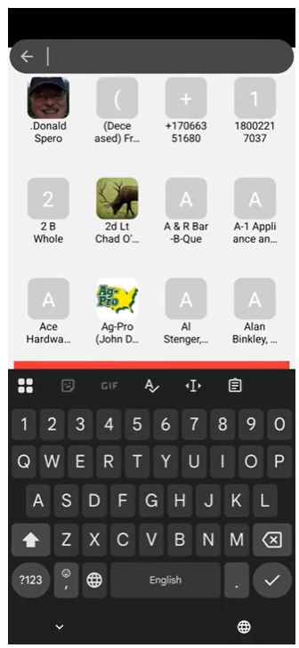
Total Launcher has built-in widgets for Apps and Contacts, which by default are shown on the page with an icon menu for adding, tagging, sorting, and searching. A keyboard does not show unless the “Search” icon is selected.
There are also two Launcher Actions that will instantly bring up specialized widgets for these two categories, which doshow the keyboard simultaneously. It is located at the top of the page, with the keyboard at the bottom. This special widget is not customizable in terms of background, size, or location. It will populate its container by searching for a topmost app drawer or contact drawer to show results. If it does not find an app or contact drawer, it opens the built-in window with an app or contact drawer.
If customization of position, size, or location and animation is desired, the suggested steps are shown below to supplement the video, since not all screen taps are visible to indicate which label was selected.
- This video starts by showing text-based Launcher Action objects for App Search and Contact Search to understand the position and appearance of these built-in specialty widgets. It then begins the window creation process
- Create a new window
- Start in Edit mode and tap the Edit Off icon
 to activate Edit On mode.
 - Tap the object add icon in the upper right of the screen
- The Add dialog opens; select Graphic
- Select Image
- Select Window
- The Window dialog opens, listing the titles of any user-created windows. These windows have design characteristics which are retained and make using a window for another purpose destructive to the original use. Therefore, select the add icon

- The title dialog opens. Enter a unique short name for the window (no spaces; use underscores (_) only), since the Launcher will ask you to specify this title later. Tap OK.
- The window object now fully appears, selected, with its default background.
- Customize the window
- Briefly, the Edit icon (white)
 appears for object relocation. See Editing an Object Setting & Location. Should the Edit icon disappear, a slight tap on the object will make it reappear.
 - Deselect the object (tap in a blank area), then tap the default window icon to open the window (default is full screen)
- Resize the window if desired by using the handles on each side (difficult at times to “grab” but keep trying). After resizing, tap-hold the window object to move it to the desired position (alternatively use the Edit icon referred to above to position the object on the x-axis & y-axis value if precise values are required)
- Tap the Option icon
 in the window's lower right corner to open the Window Option dialog.
 - This demo will customize the window background. Tap Background and from the listing, select Image
- The user's Image resource dialog opens. If no suitable image exists, add one. Tap the Add icon, then navigate to a device location or the cloud (direct website access is not available for downloading and placing any acquired images before this step). Once the desired image is in resources, tap it. The image is now shown in the Background's thumbnail.
- Back out (swipe right-to-left) to return to the page and see the window selected, with the new image background.
- Deselect the window (tap any blank area). The default window icon still shows.
- Place an app drawer widget in the created window
- In the Page Design menu, tap the object add icon
 in the upper right of the page
 - From the Add dialog, select Widget.
- This video demo will use the App Drawer widget. Tap it. The widget immediately appears centered on the page. In this case, it is over the window object and must be relocated to allow access to it. Tap-hold the App Drawer widget and relocate it anywhere (it will be removed later).
- The App Drawer widget is still selected. In the top Object Design menu, tap the copy icon
 to place a copy in the Launcher's memory.
 - Tap the newly created Window icon to open the window previously resized and relocated.
- VIDEO DEFICIENT To paste the App Drawer widget into the open window, tap the object add icon (upper right) and tap the paste icon
 . The Window now contains the App Drawer copy.
 - Tap any blank area to remove the focus from the window and close it. The default window icon remains visible.
- To change the default icon, select the window icon, then tap the Object Design menu Option icon to open its Edit Option dialog.
- This video demo will only change the image (other options such as pressed and background are available) with the objective of making the icon invisible since the window will be activated by other means.
- Tap image to open the Image options dialog. Select Color
- For an “invisible window icon,” the color will be set to transparent, represented by an ARGB hex #. Replace the existing # with the value
00000000. For more information on using this Color Picker utility, see here. Tap OK. - Back out of the dialog by swiping right-to-left
- The window object is shown, selected. Tap any blank area to deselect it… see nothing… tap the window “area”… the window itself opens.
- Further adjust the App Drawer container.
- Tap-hold the edge of the container (usually the lower-left corner) to reveal the resizing handles, or tap-hold the object centrally to move the container.
- Once satisfied, tap outside the container to close the window. To reopen it, tap in the area where the now-invisible window icon is.
- Set an Action to open the Window
- Select the App Drawer/Window, then tap the Option icon in the lower right corner of the container to open its Option dialog.
- Notice the section Gesture to close. This will be covered later. Scroll to the section Action on open and tap it
- The dialog Action on Open opens. Scroll down to “App Search” and select it
- The Window Option dialog re-opens. Scroll up to “Gesture to Close” and select it.
- The Gesture to Close dialog opens to its default “No gesture”. This demo video selects “Swipe up” and the navigation returns to the Window option dialog. Back out of this by swiping right-to-left to return to the page with the App Drawer Window selected.
- Tap any blank area to remove the focus and the window disappears. Tap the window area to open the App Drawer now with its keyboard following. Swipe down to close.
- Project completed!



Comments & Feedback
Toby Lancer is ready to help! Look for the Quick Help form:
► Desktop: left sidebar located near the bottom for Private to Admin
► Mobile: 3-bar menu at page top.
► Use the Discussion section below to share any experiences and communications with other Total Launcher users.
► Any Registered User can directly update this and any wiki page if desired.
Moderation: To keep the manual clean, all comments are held for appropriateness review. Preview any comment before submitting it. It will not be displayed after submission until it is reviewed. So, please, do not resubmit.
Formatting: If using any code snippets, place them inside code tags (e.g., 'code') using double single quotes (') before and after to keep them readable.
Be Kind: This is a community effort. Please keep feedback constructive and on topic.
~~DISCUSSION~~