meta data for this page
Android Homescreen Design Tutorial: Designing Advanced Material Card and Icon Drop Shadow Effects in Total Launcher
The pursuit of the ultimate Android homescreen setup requires granular control over visual depth and interface layering. Implementing professional card layouts and distinct icon drop shadows separates standard mobile interfaces from elite, customized configurations. Within Total Launcher, mastering these dimensional styles transforms flat design elements into dynamic, interactive components that elevate the overall user experience. This technical guide outlines the precise steps necessary to build, scale, and apply soft lift, contrast, and hard drop shadows to shapes and images.
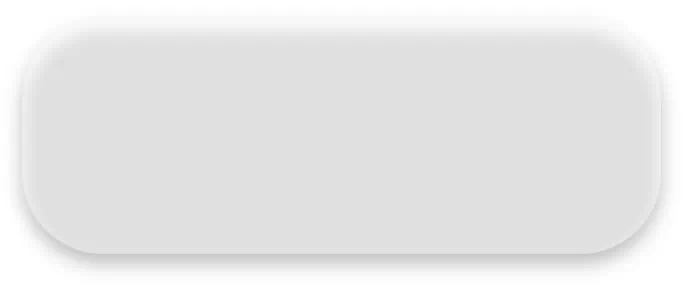
- Examples of the shadow effects to be created below:
| Soft Card on Light Background with a Soft Drop Shadow | Button/Icon Soft Lift Contrasting Shadow on Dark Background | Icon/Button with a Soft Lift Shadow for Light Background | Icon/Button with a Hard Lift Shadow for Light Background |
|---|---|---|---|
 |  |  |  |
The process begins with preparing the environment for optimal visual contrast.
Prerequisite: Background Layer Setup
- A shadow effect requires a complex, colorful, or polar background layer to be visible. Ensure the layer behind your shadowed objects— whether that is the system wallpaper, a page background image, or a background graphic object — is a colorful photograph or gradient, not a solid white or black color.\
- The created shadows will be selected as the Background for the “button shape” or “icon image” used.
Phase 1: Create the Shadows
- Create the Shadow A (Soft Card Shadow for Light Background)
- In Edit mode (pinch in) select
Launcher Options>Resources>Shadow - Tap the “Add” icon
- For “Label” enter
Soft_Card_Shadow_Light_Bkgd- “Shadow color”: Tap the box area and select “Color”. For #ARGB enter
80000000(or Black with ~25% opacity) - The “color box” for “OK” will change. Tap it to return to the “Shadow Add” dialog.
- For “Shadow radius” enter
32 - For “Shadow Offset X” enter
0 - For “Shadow Offset Y” enter
10
- Tap OK to return to the Shadow dialog
- Create the Shadow B (Button Soft Lift for Dark Background)
- Tap the “Add” icon
- For “Label” enter
Button_Lift_Shadow_dark_bkgd - “Shadow color”: Tap the box area and select “Color”. For #ARGB enter
5AFFFFFF(or Black with ~35% opacity) - The “color box” for “OK” will change. Tap it to return to the “Shadow Add” dialog.
- For “Shadow radius” enter
22 - For “Shadow Offset X” enter
15 - For “Shadow Offset Y” enter
15 - Tap OK to return to the Resource dialog
- Create the Shadow C (Button Hard Lift for Light Background). Note: This duplicates the previous shadow, but the shadow color changes to contrast with the destination background to provide the offset.
- Tap the “Add” icon
- For “Label” enter
Button_Lift_Shadow_light_bkgd - “Shadow color”: Tap the box area and select “Color”. For #ARGB enter
80000000(or Black with ~35% opacity) - The “color box” for “OK” will change. Tap it to return to the “Shadow Add” dialog.
- For “Shadow radius” enter
22 - For “Shadow Offset X” enter
15 - For “Shadow Offset Y” enter
15 - Tap OK to return to the Resource dialog
Phase 2: Create the Shapes
- Create the Card Shape (used for main panels and widgets)
- Back out to the Resources dialog and select
Shape - Tap the
Addicon - For “Shape,” select
Round rectangle - Tap its Option icon and for its radius set
28 - “Color1”: Tap the icon, select “Color”
- For #ARGB enter
3CFFFFFF(Note: The 1st 2 digits represent Alpha. 3C is ~60% opacity for a frosted look) - Tap OK
- “Border width” set at
1, do not tap OK yet - “Border color”: tap and select “Color” and for #ARGB enter
26FFFFFF - Label: enter
Shadow_Cardand tap OK to return to the Shape dialog
- Create the Button Shape (used for icons and taps)
- Still in the Shape dialog, tap the
Addicon - For “Shape,” select
Round rectangle - Tap its Option icon and for its radius set
20 - “Color1”: Tap the icon, select “Color”
- For #ARGB enter
50FFFFFF(represents Alpha of ~80% for a slightly more solid button) - The “color box” for “OK” will change. Tap it to return to the “Shadow Add” dialog.
- “Border width” will remain at
0(not used) - Label: enter
Shadow_Buttonand tap OK to return to the main menu
Phase 3: Apply the Resources to Objects
- Apply to a “floating” app icon
- In Edit On mode, tap the
Addicon in the Page Design Menu - Select
Graphic>Image>Default>Icon packs - Scroll or use the search dialog to select the desired icon. Tap to select it.
- The App icon is on the page and selected. In the Object Design menu, tap the “Option” icon
- In the main Option Edit dialog, tap
Background>Shape>Shadow_Button - In the main Option Edit dialog (do NOT tap Background again), scroll to find “Shadow” > select
Button_Lift_Shadow - Tap “Margins” and set to
14for all 4 sides. Tap OK.
- Create a visual “Shadow Card” panel on the page
- In Edit On mode, tap the
Addicon in the Page Design Menu - Select
Graphic>Shape - The default shape is placed on the page. In the Object Design menu, tap the “Option” icon
- In the main Option Edit dialog, tap “Shape” > select
Glass_Card - In the main Option Edit dialog, scroll to find “Shadow” > select
Soft_Card_Shadow - Tap OK.
- Resize this panel to your desired dimensions.
- Note: Ensure this panel is layered behind your icons by tapping its option menu and selecting “Send to back”.
Comments & Feedback
Toby Lancer is ready to help! Look for the Quick Help form:
► Desktop: left sidebar located near the bottom for Private to Admin
► Mobile: 3-bar menu at page top.
► Use the Discussion section below to share any experiences and communications with other Total Launcher users.
► Any Registered User can directly update this and any wiki page if desired.
Moderation: To keep the manual clean, all comments are held for appropriateness review. Preview any comment before submitting it. It will not be displayed after submission until it is reviewed. So, please, do not resubmit.
Formatting: If using any code snippets, place them inside code tags (e.g., 'code') using double single quotes (') before and after to keep them readable.
Be Kind: This is a community effort. Please keep feedback constructive and on topic.
~~DISCUSSION~~