meta data for this page
Total Launcher Dynamic Color Guide: Material You Customization
Total Launcher features a Dynamic Color Scheme designed to integrate Android's Material You engine directly into custom homescreen layouts. By automatically harmonizing interface elements with active wallpapers, the system creates cohesive visual designs without requiring manual hex code adjustments.
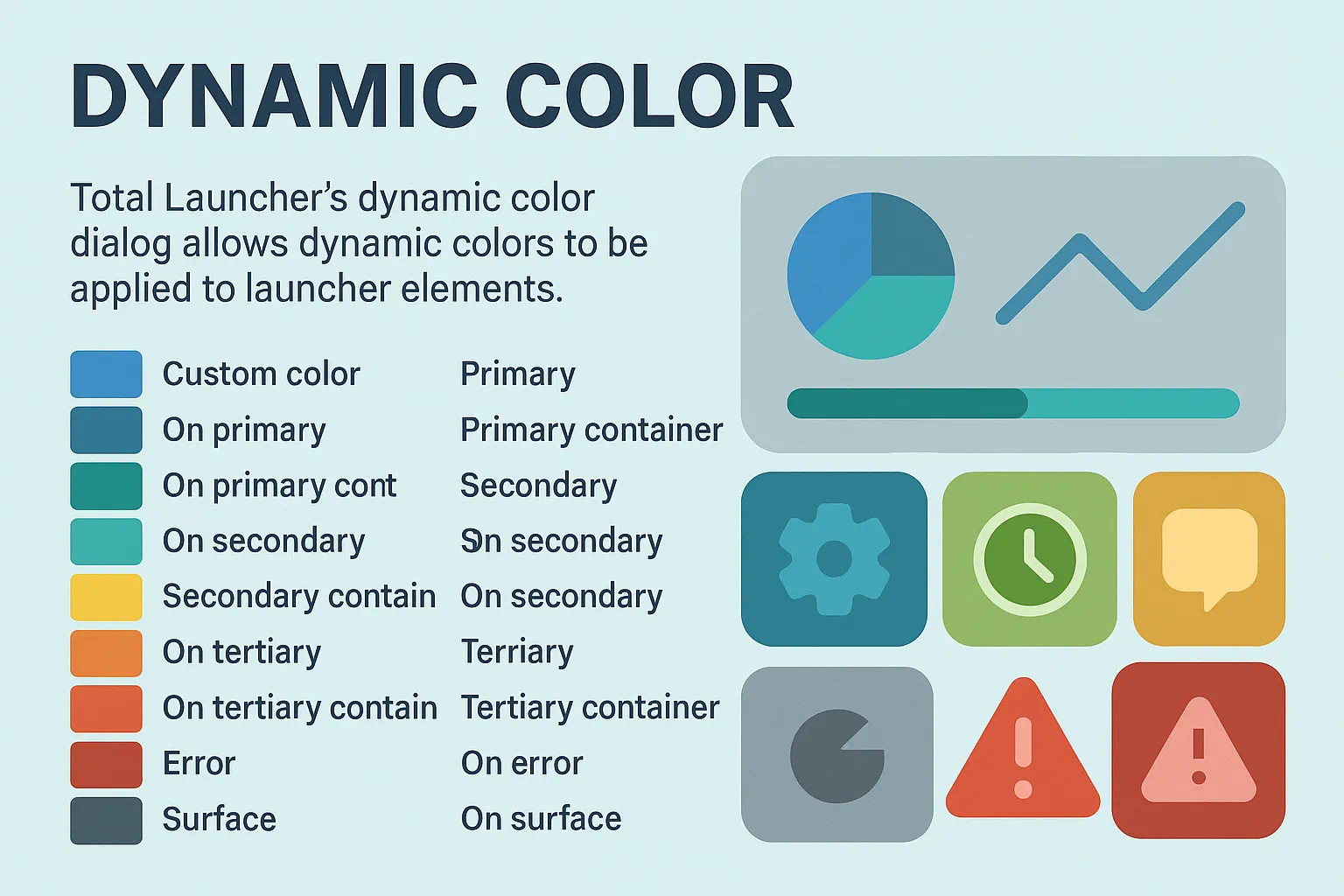
What it Does
Total Launcher leverages Android's Material You (M3) system to create a harmonized look for the home screen. Instead of manually picking a color for every text or icon, an object is assigned a Role.
Google introduced Material Design in 2014 to standardize Android UIs, evolved it into Material Theming in 2018, and released Material You (M3) in 2021 based on the philosophy of “Form Follows Feeling.” Its *Monet* engine extracts colors from your wallpaper to generate 5 tonal palettes with 13 shades each, applying them across the OS. Total Launcher hooks directly into these OS tokens.
Turn It On
To enable the dynamic color engine across Total Launcher:
Edit mode>Launcher options>UI & Animation>Dynamic Color Scheme[turn on]
How to Apply Dynamic Color to an Object
Once the global setting is on, assign dynamic colors to individual elements on the screen:
- Long-press any object (Text, Shape, Icon, or Image) and enter Edit Mode.
- Tap
Optionsin the Object Design menu - Select the specific element (text, background, image, etc.)
- In the dialog that opens, select
Dynamic Colorto open the Dynamic Color dialog and the role picker. - For the object that was originally selected, now choose a Role (e.g.,
Primaryfor a main button, orOn Primaryfor text inside that button).
To detach an object from the dynamic wallpaper theme and use a fixed color instead, select Custom Color at the top of that same dialog.
The Master Plan: A Museum Exhibit
Think of your device screen as a Museum Exhibit. When Material You (M3) is enabled, the system acts as a “Master Curator.” The Curator’s job is to ensure that every part of the exhibit works together in perfect color harmony based on the active wallpaper.
Instead of picking static colors, you assign Roles to your objects:
- Primary (The Main Exhibit): The “Star of the Show.” Use for key search bars or main action buttons. It wears the most vibrant color to grab immediate attention.
- Secondary (The Support Gallery): Supporting actors. Use for secondary icons or smaller widgets. They stay in the same color family as Primary, but are muted to keep the layout clean.
- Tertiary (The Highlight): A single spotlight on a specific artifact. This is a “surprise” color that adds variety and “pop” (like a clock widget or a notification badge).
- Neutral & Surface (The Walls & Floor): The museum building itself. These provide subtle background tones that allow accented elements to shine.
- The “On” Roles (The Labels): Clear labels required for readability. “On Primary” or “On Surface” roles are text/icon colors engineered by the OS algorithm to guarantee high contrast against their respective background roles.
The Curator in Action
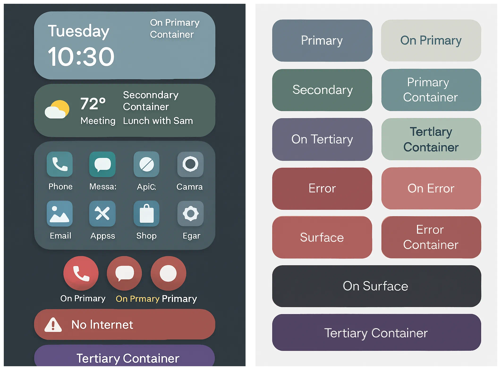
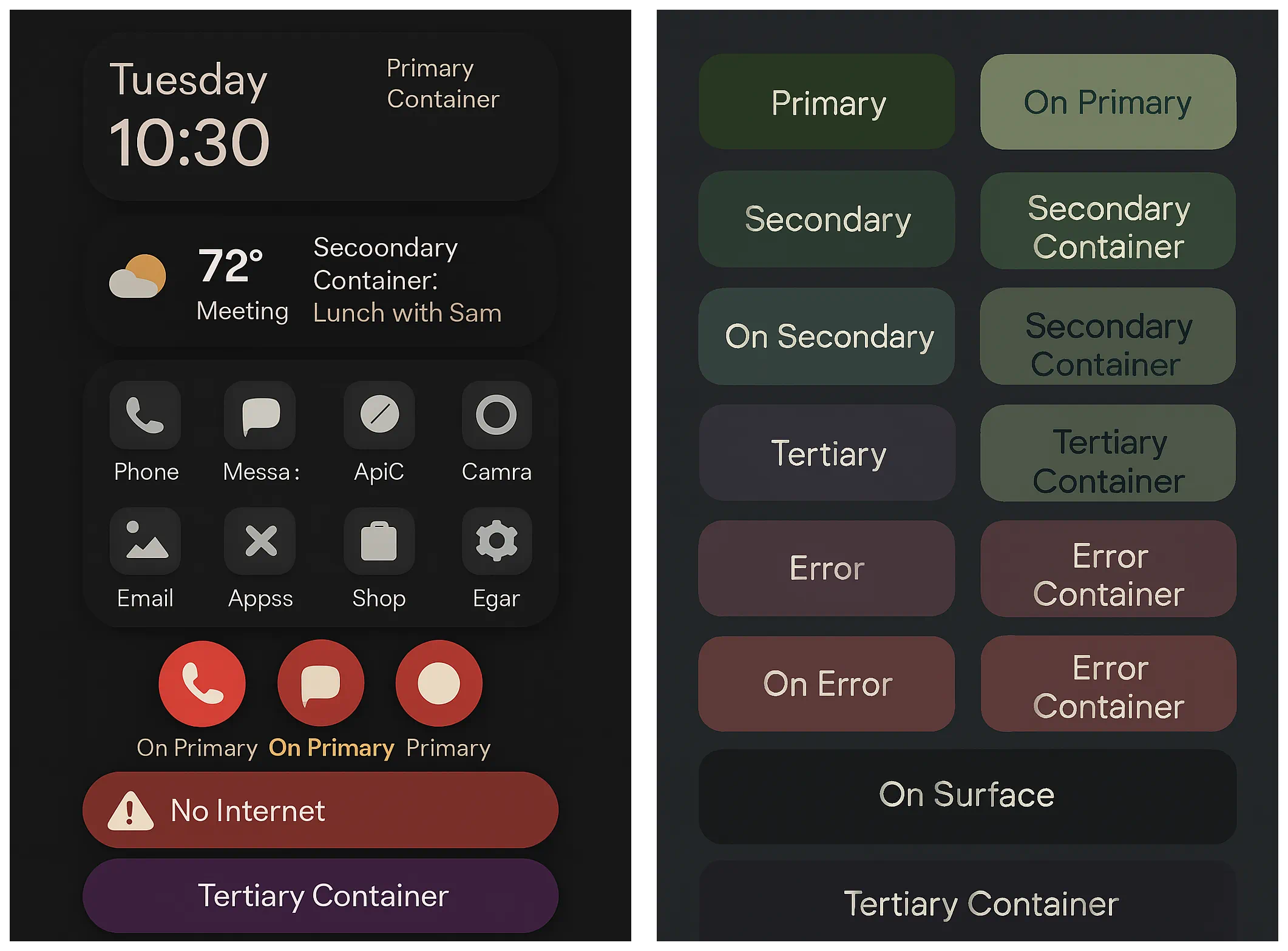
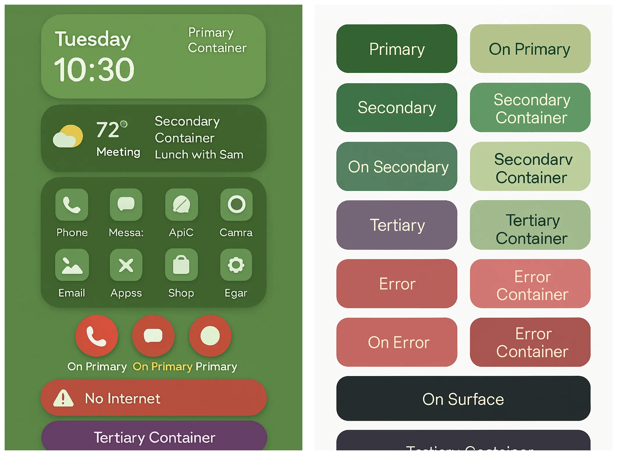
These samples demonstrate how the exact same objects (clock, icons, buttons) automatically shift their “costumes” whenever the Curator changes the system theme:
Basic Theme
Dark Theme
Green Theme
Dynamic Color Cheat Sheet
This table contrasts the Dynamic Path (listening to the OS Curator) with the Custom Path (the static override):
| If choosing… | The Object follows… | Dynamic? | Best for… |
|---|---|---|---|
| Custom color | Manually assigned ARGB codes | NO | Minimalist B/W, fixed brand colors, or custom Day/Night themes. |
| Primary | Main System Accent | YES | Most important buttons, headers, and primary actions. |
| On Primary | OS Contrast Algorithm | YES | Text or icons placed on top of Primary backgrounds. |
| Secondary | Supporting Accent | YES | Secondary widgets, filter chips, and sub-headers. |
| Tertiary | Complementary Accent | YES | “Pop” accents like clocks, notification badges, or highlights. |
| Surface | System Background Tones | YES | Page backgrounds, card containers, and tile bases. |
Note: If your launcher shows “No Wallpaper,” M3 defaults to a neutral “Baseline” palette (usually dark blue or grey). To see the dynamic effect clearly, temporarily apply a vibrant wallpaper.
Troubleshooting & Tips
My colors aren't changing!
If you change your wallpaper but your “Primary” text stays grey or blue, check the following:
- The “Baseline” Trap: If the wallpaper is solid black, white, or neutral, M3 defaults to a fallback grey/blue palette. Use a vibrant wallpaper to test system response.
- Sync Wallpaper: Ensure
Launcher options>UI & Animation>Sync system wallpaperis enabled if you want Total Launcher's background to match your system. - The “Force Refresh”: If Android fails to push the new palette tokens to Total Launcher:
- Restart the launcher:
Launcher options>Troubleshooting>Restart Total Launcher. - Toggle the
Dynamic color schemeoption OFF and back ON.
- Custom Overrides: An object set to Custom Color completely detaches from the Material You script and will ignore wallpaper changes.
Technical Architecture & Community Observations
Total Launcher operates as a flexible GUI overlay running above the Android system UI. Understanding how it interfaces with Google's Material 3 API helps explain some of its unique dialog behaviors:
- Decoupled Roles: Unlike standard launchers that apply dynamic colors universally across predefined grids, Total Launcher exposes the full M3 token list to individual objects. A button or text object only obeys Material You if you explicitly assign it an M3 role (`Primary`, `Secondary Container`, etc.).
- Google API Boundaries: Total Launcher queries live M3 color tokens directly from the system OS. If third-party wallpaper tools (like *DualWallpaper*) pass transparent or modified backgrounds to the OS, Total Launcher can only render the specific color tokens returned by Android.
- The Custom Color Isolation: The Custom Color option in the Dynamic Color dialog is a native, internal Total Launcher utility designed for static Day/Dark mode manual assignments. Because it operates entirely outside the Material You API, opening the Custom Color dialog will not pre-fill or “read” an object's current dynamic color—it functions as a separate override slate.
Discussion