meta data for this page
Create a Card or Icon Shadow Effect With This Total Launcher Tutorial
Prerequisite: Background Layer Setup
- A shadow effect requires a complex, colorful, or polar background layer to be visible. Ensure the layer behind the shadowed objects, whether it's the system wallpaper, a page background image, or a background graphic object, is a colorful photograph or gradient, not solid white or black.
Create modern UI with 1 Card Shape, 1 Button Shape, and 2 Shadows
► Create the Shape Resources
➡️ This procedure creates the “glass” panels by defining their shape, radius, and degree of partial transparency. Total Launcher now displays transparency as a percentage, with 0% fully transparent and 100% fully opaque. If manually typing colors, the format is #AARRGGBB (Alpha code comes first), or simply use Total Launcher's Alpha percent slider after setting the HSV sliders.
Glass Card Shape (for main panels and widgets)
- Shape: Rectangle.
- Radius: 👉 28.
- Fill: Solid white color (#FFFFFFFF)
- Alpha: For this “light glass” effect, target partial transparency with an Alpha value of 18–25% visual opacity.
- Border (Optional): Add a subtle white border with a width of 1 and a very subtle Alpha value of around 20% visual opacity.
Glass Button Shape (for icons and taps)
- Duplicate Glass Card, then make changes.
- Radius: Set to 20.
- Fill Alpha: Target a slightly stronger fill with an Alpha value of approximately 25–32% visual opacity.
► Create the Shadow Resources
The core targeting effect makes objects appear to float by adjusting specific shadow parameters. Total Launcher requires specific ARGB values for the shadow color and uses standard terminology such as shadow radius and offset.
- Crucial Beginner Mistake to Avoid: Avoid huge blur values, as they kill performance. Stay under 40.
- Color Setting Note: Total Launcher's standard user interface handles shadow color through the standard shadow dialog, where parameters include label, shadow color, shadow radius, and shadow offset X/Y.
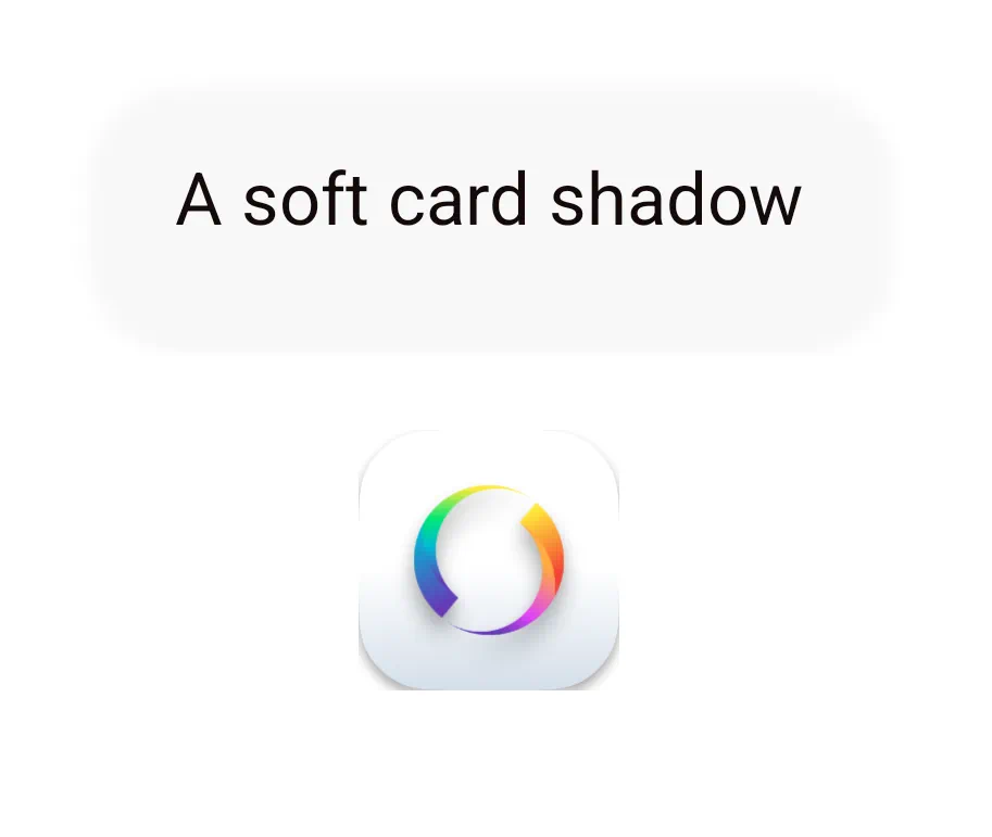
- Soft Card Shadow (Shadow #1)
- Blur/Shadow Radius: Set to 32.
- Offset Y: Set to 10.
- Offset X: Set to 0.
- Color Opacity Target: The procedure targets a visual opacity with an Alpha value of 25%
- Target Shadow Color: Black (ARGB #46000000).
- Button Lift Shadow (Shadow #2 for Icons)
- Blur/Shadow Radius: Set to 18.
- Offset Y: Set to 6.
- Offset X: Set to 0.
- Color Opacity Target: For this stronger effect, target an opacity with an Alpha value of 35%.
- Target Shadow Color: Stronger black with an ARGB value of #5A000000.
► Combine and Assign for the Targeting Effect
- Final Implementation: Once shapes and shadows are created and assigned within the Total Launcher user interface, the target combinations should be applied to objects:
- Cards use: Glass Card shape combined with the Soft Card Shadow.
- Buttons and Icons use: Glass Button shape combined with the Button Lift Shadow.
For Modern UI Layout: Beginner mistakes include building everything directly on the static home page. Modern UI designs prioritize using the Total Launcher customization feature windows, which feel like overlays.
Targeting the “Proper” Shadow
There is no single “correct” shadow setting, but there IS a correct target: Contrast. To make an object feel like it belongs in its environment, look for contrast in Value (light vs. dark), Temperature (warm vs. cool), and Saturation (vivid vs. muted).
Recommended Design Palettes
Use these ARGB values and technical offsets to build your Shape Resource before assigning it to the Image slot.
| Style | Shape Fill | Shadow (ARGB) | Radius | X/Y Offset | Visual Effect |
|---|---|---|---|---|---|
| Deep Depth | #FFFFFFFF | #80000000 | 20 | 8 / 12 | High-elevation “floating” card; max value contrast. |
| Natural/Soft | #FFFFFFFF | #405C5C5C | 12 | 4 / 6 | Realistic lift using “cool” temperature contrast. |
| Modern Glass | #CCFFFFFF | #50001A33 | 8 | 0 / 3 | Defined edges using hue-shifting against dark backgrounds. |
| The 1% Hack | #01FFFFFF | #35000000 | 5 | 2 / 2 | Rule 3: Creates a 3D hollow ring on light backgrounds. |
⚠️ Technical Requirement: The Margin Formula
Every shadow exists within a strict rectangular bounding box. If a shadow casts outside this box, it is immediately clipped (cut off flat). To prevent this, you must use the Margins input in the Object Edit menu.
The Formula: (Apply only to the quadrants where the offset is directed).
Required Margin ≥ (Shadow Radius ➕ Shadow Offset)
Margin Requirements for Scenarios
| Style | Required Margin in the cast direction (“+X” = Right / “+Y” = Bottom) (“=X” = Left / “-Y” = Top) | Technical Logic |
|---|---|---|
| Deep Depth | 32 px | Radius (20) + Offset (12). |
| Natural/Soft | 18 px | Radius (12) + Offset (6). |
| Modern Glass | 11 px | Radius (8) + Offset (3). |
| The 1% Hack | 7 px | Radius (5) + Offset (2). |
Implementation Workflow
- Build the Resource: Create a new Shape Resource. Input the Fill, Shadow Color ARGB #, Radius, and Offsets from the table above.
- Assign the Image: Open the Object Edit menu and assign your custom shape to the Image slot.
- Set the Background: Assign your desired surface color or image to the Background slot.
- Apply Margins: Immediately navigate to the Margins section at the bottom of the Edit menu. Enter the calculated Min. Margin for the Right and Bottom fields to ensure the shadow renders fully without clipping.
💡 TIP: The Shadow Target
There is no “correct” shadow setting, but there IS a correct target: Contrast. Use Value for height, Temperature for realism (cool shadows for warm objects), and Saturation for clean, modern edges. Always ensure your Object Margins >= Radius + Offset to prevent the “flat-edge” clipping bug
The Single-Object Procedure
To achieve the exact result in your image (a white card with a border and shadow) using only one Graphic Object, configure it like this: ^ Menu Level ^ Property ^ Value / Setting ^ Technical Reason ^
| Image (Slot 1) | Resource Type | Shape | The shape must be in the foreground to allow a shadow behind it. |
| Color 1 | #FFFFFFFF | The solid fill of the card. | |
| Border Width | 1 or 3 | Defines the outer boundary of the object. | |
| Background (Slot 2) | Resource Type | Shadow | You must assign “Shadow” directly to this single-occupancy slot. |
| Shadow Color | #80000000 | The semi-transparent black shadow color. | |
| Radius / Offset | 20 / 5 / 5 | Your preferred elevation settings. | |
| Options (Gear) | Margin | 25+ | Rule 1: Must be Rule 1: >= Radius + Offset to prevent clipping. |
Discussion