meta data for this page
Beginner's Basic Editing Steps
Anxious to begin right now … before reviewing the rest of the manual? Perhaps experimenting just to get a feel for starting the first setup or theme?
To Enter Edit Mode
Edit Mode
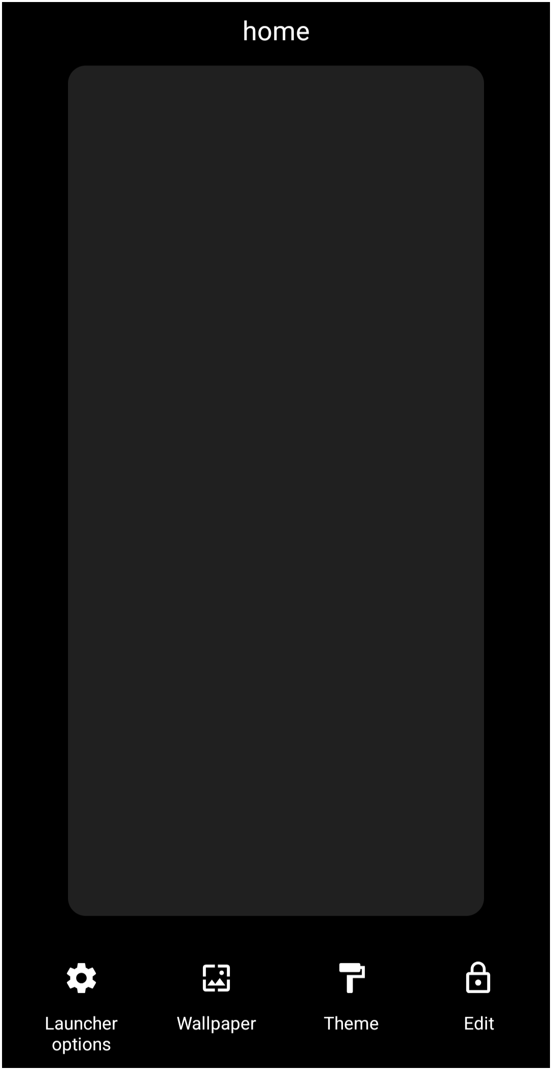
1. “Tap and Hold” any “open” area of the screen.
2. Enter the password if the requirement has been set up (see Password Protection).
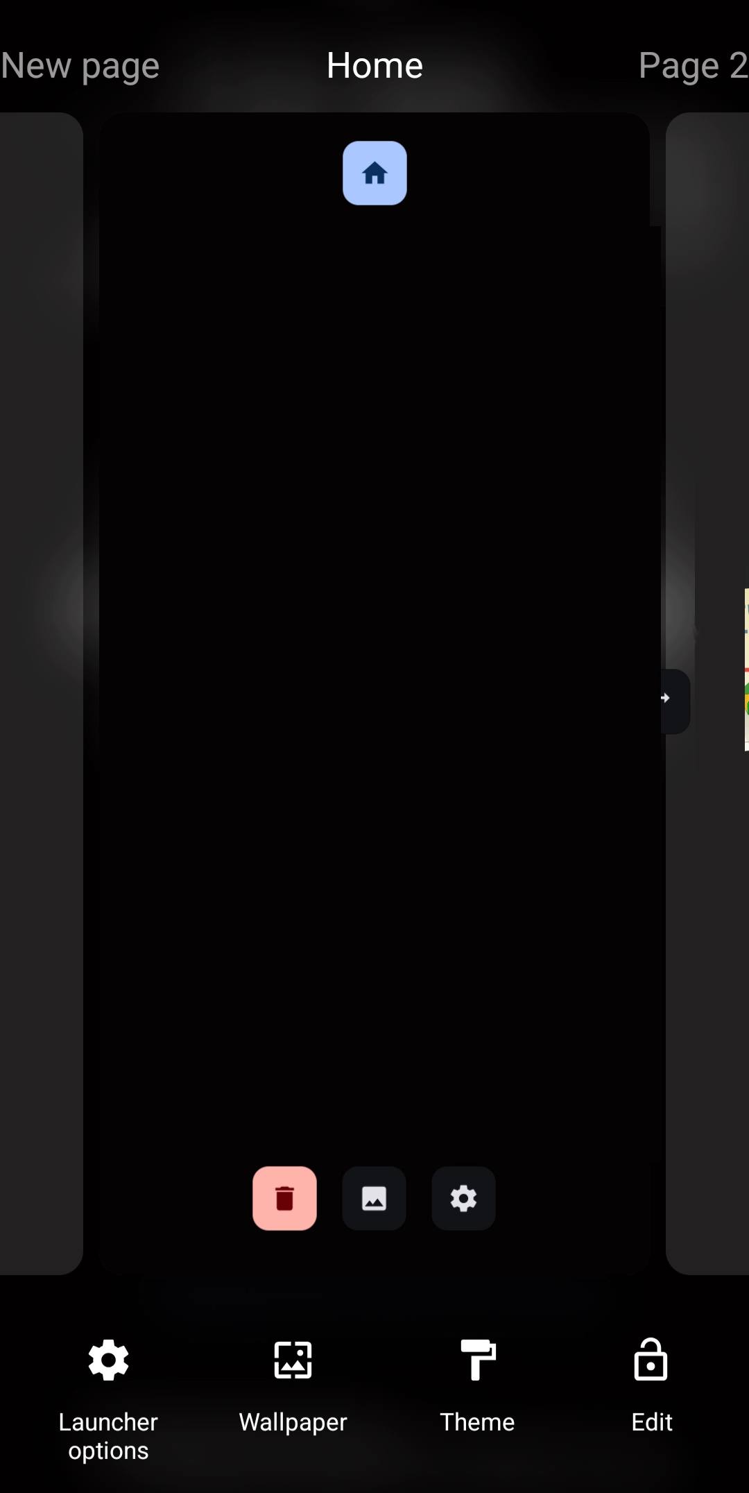
3. Tap the “Edit Off”  icon in the lower right screen area to enter “Edit On” mode as shown in the image below.
4. Edit On mode is now displayed.
5. View the image on the right and the descriptions in the table below.
Edit On
| ICON TABLE | ||
|---|---|---|
| Object | Image | Description |
| Edit |  | Edit mode. Note the 'lock' is locked! |
| Edit On |  | Edit On mode. Note the 'lock' is unlocked! |
| Home Page |  | Visible in the center of the screen. On either side are additional pages. Scroll left or right to center the desired screen, then tap its home icon to set it as the home page. |
| New page |  | Swipe right to reveal a new page. Tap the “+” to add a new one. |
| Delete |  | The displayed page is removed if tapped. |
| Background |  | To place an image or other object as a background, tap here. |
| Options |  | View the customization features for the page. |
| Launcher options |  | Tap to view launcher features. |
| Wallpaper |  | Set the wallpaper for the layout. |
| Themes |  | The developer has included selected theme collections available from Google Play. |
To Add an Object
- An object can be images, text, widgets, icons, clocks, windows, and more.

- Enter Edit mode (see How To Enter Edit Mode above)
- In the upper right corner of the screen, tap the “add” icon
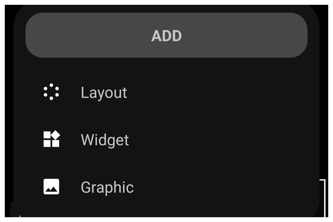
- The Design Add dialog opens in the lower left screen area listing the 3 categories of objects:
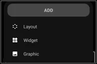
- Layout includes the spatial placement of objects in a grid or circular arrangement, with the number of each changeable. Note that layouts (or placing objects on the page) can also be done by adding shortcuts.
- Widgets are dedicated objects with a specific purpose, such as weather data, media controls, app drawers, and many more. Most special-purpose widgets are built into Total Launcher, while application widgets come from applications the user has installed on the device. For a complete description, see Widgets.
- Graphics can be image-based, text-based, or a combination (grouped) of the two types. Each can be static or dynamic, such as your background wallpaper, calendar event list or next calendar event, app notifications, and many, many more.
Tip: During design, if an object is copied for placement elsewhere on the screen(s), a 4th item will be listed in this dialog as “Paste”. Tapping that selection will place the copied object in the center of the current screen.- When added to the screen (page), the objects are placed, centered, and already selected. Being selected (highlighted) means it can be moved and edited.
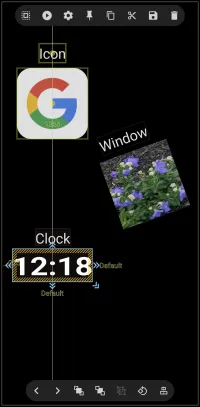
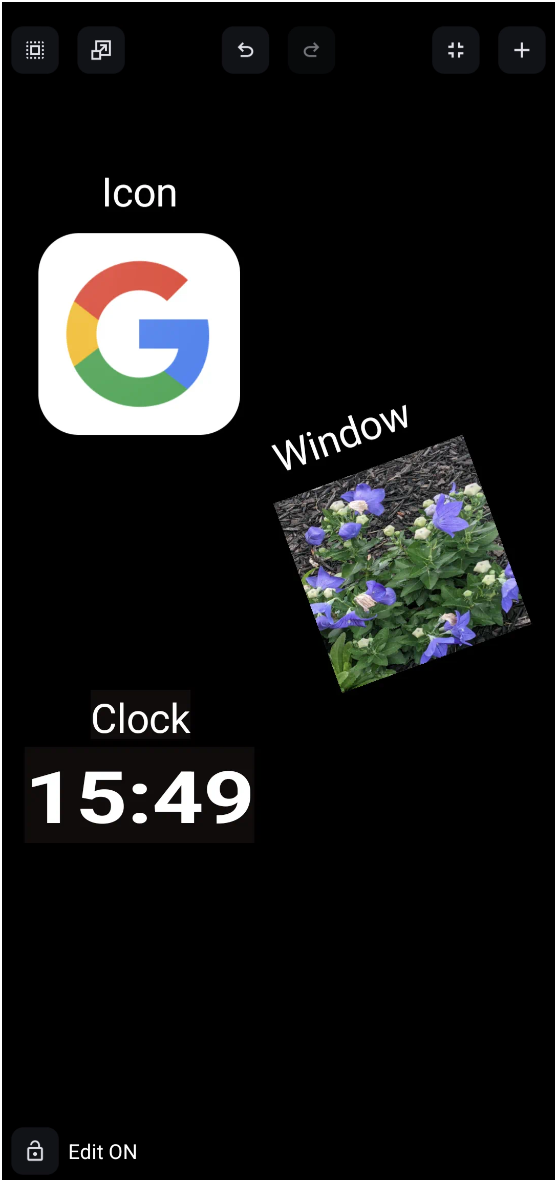
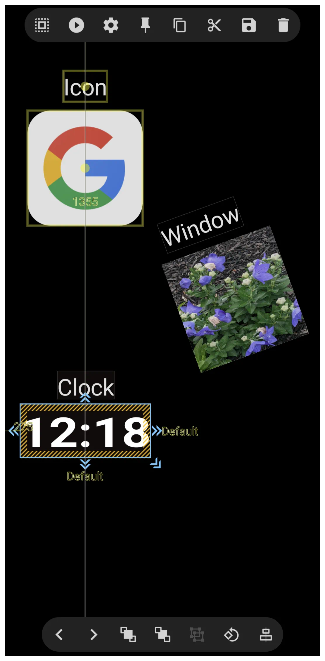
- The above sample includes an icon, image, and clock as objects, each with a text label that is also an object.
- The Time object has been selected by a “tap and hold”. Selection always results in a highlight or outline of the object. Selection can also be made of multiple objects, such as the text “Clock”; another “tap and hold” of that text would expand the selection
- Notice the vertical white line which runs through the “colon” and the “G”. This is an alignment guideline which will show only when 2 objects are centered. While the sample shows vertical alignment, horizontal alignment is also shown automatically if applicable.
To exit Edit mode:
- To turn off Edit Mode, tap the
Edit Onbutton icon in the lower left corner of the screen which will toggle to
 Edit Off.
To toggle Edit mode on/off:
If frequent editing is required, an object can be added to a page to support this action.
- Enter Edit mode (see How To Enter Edit Mode above)
- Add an object (see To Add an Object). Use an image, text, or even a hidden item/location.
- After adding the object, a dialog will list possible actions.
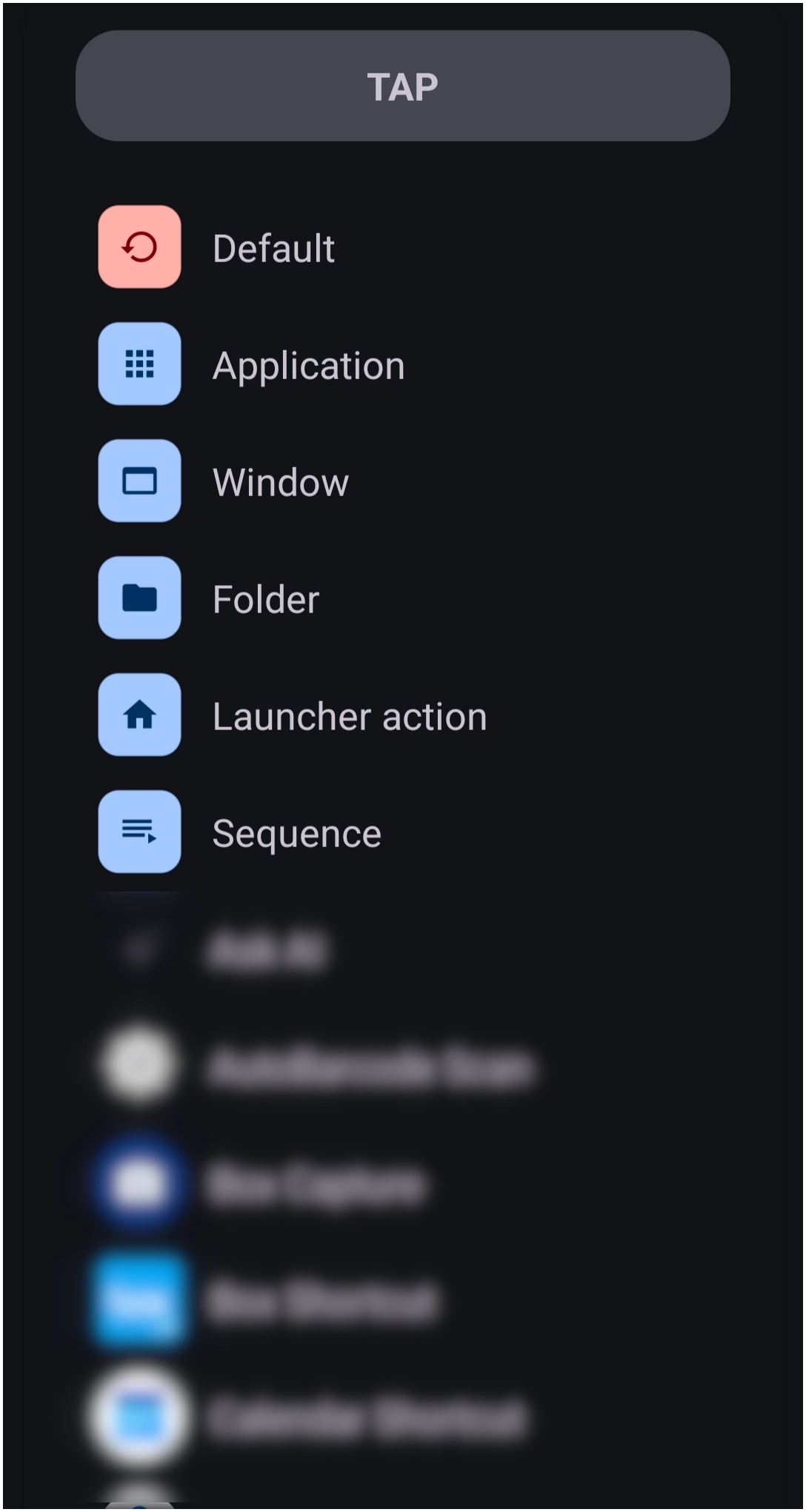 | 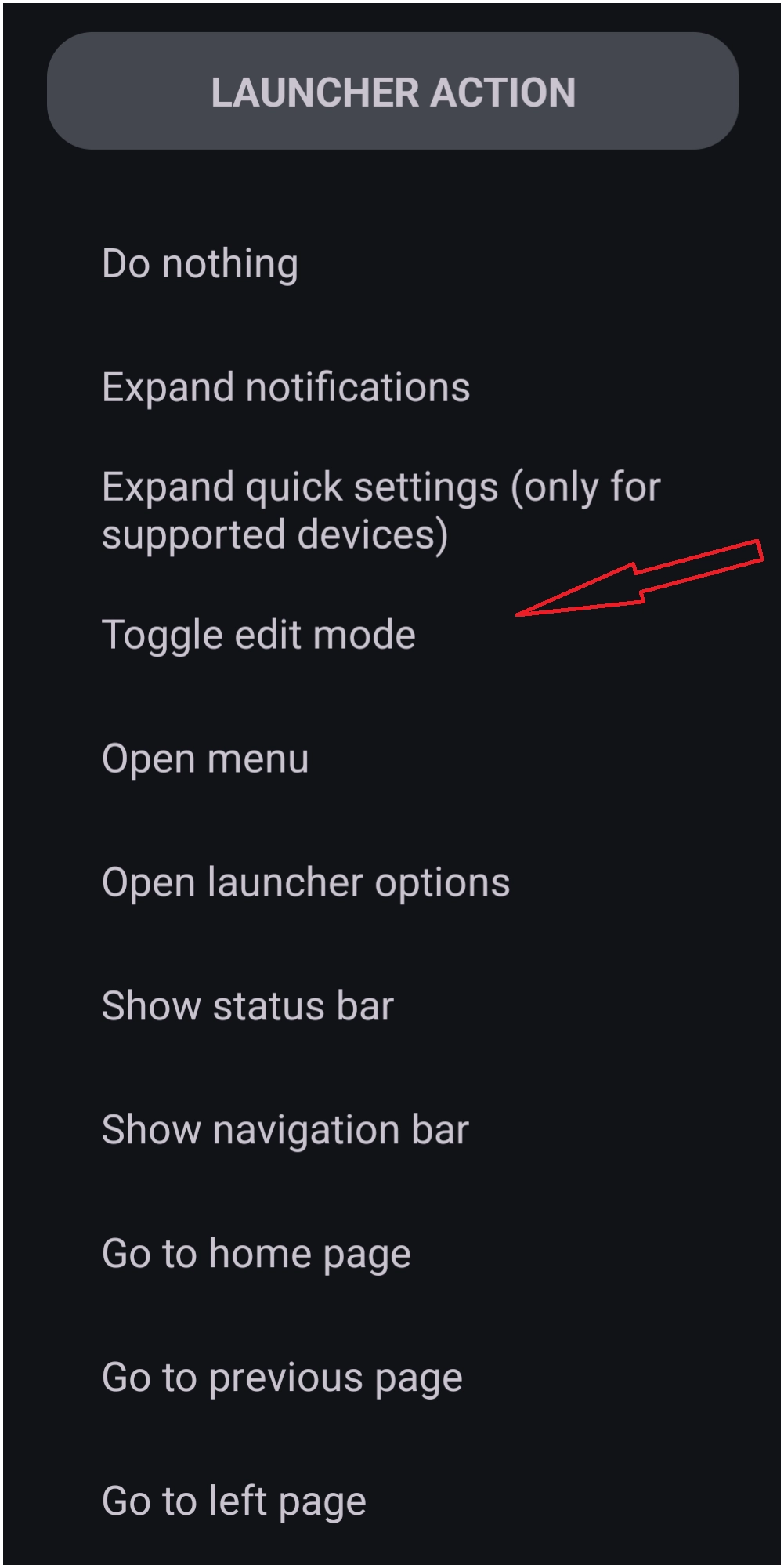 |
- Select Launcher Options
- Select Toggle Edit Mode
- The object, when tapped, will now toggle between Edit On and Edit Off
Edit an Object Setting & Actions
Object Edit
- Immediately after selecting an object, 2 edit options will show in the screen center: “pencil” icon for edit and “compass” icon for movement. These icons stay on the screen for less than 2 seconds, but can be reactivated by tapping the object again.

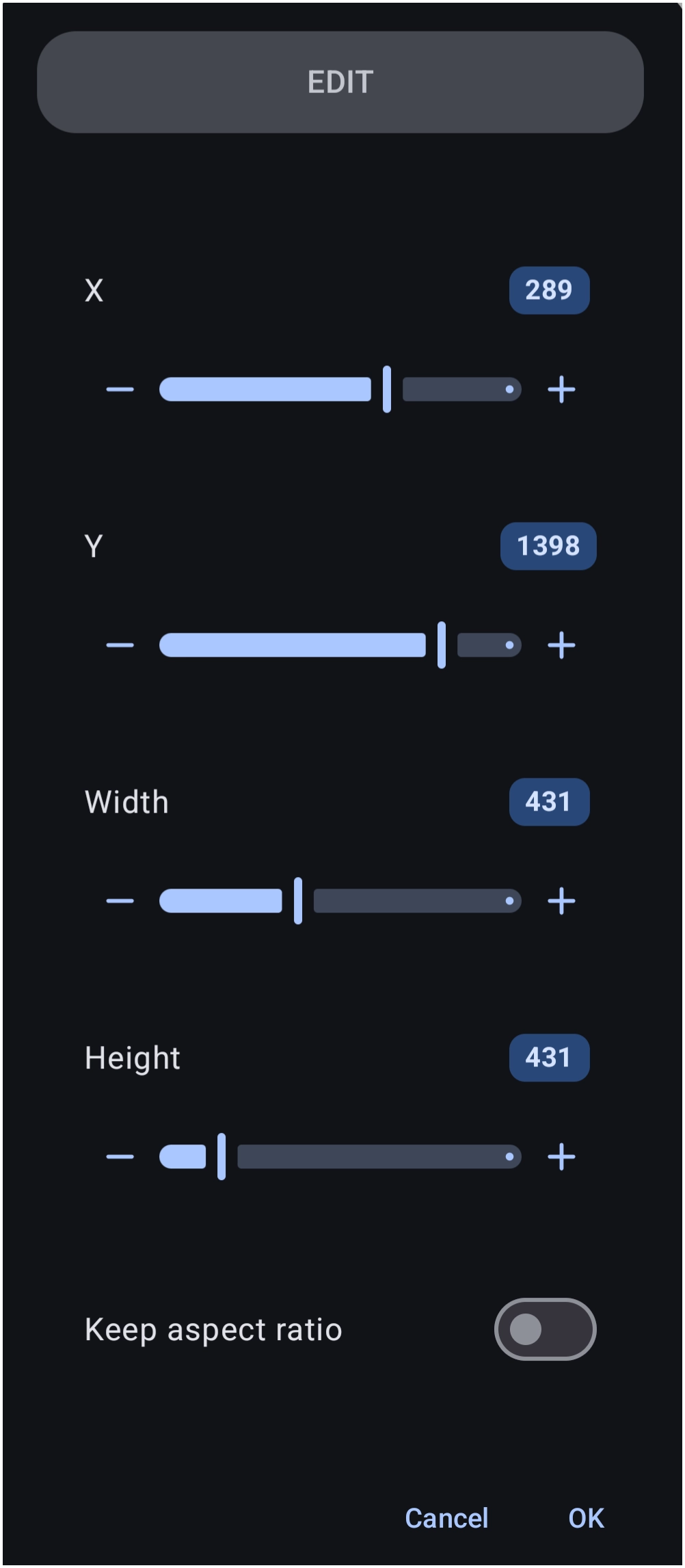
The “pencil” icon (Edit) opens as shown below

- “X” and “Y” are the x-axis (horizontal) and y-axis (vertical) position values of the object, in pixels, with 0 for each being in the upper left corner. Screen sizes and resolutions vary, but typically, a screen could be an x-axis with 1055 viewable pixels and a y-axis with 2100 viewable pixels.
- “Width” and “Height” of the object are in pixels and can be modified. Decreasing these from the initial value will result in part of the object being obscured, while increasing the values will be similar (not quite) to adding a border to the object. [Borders will be properly addressed later] However, if “Keep aspect ratio” is checked prior to changing either width or height, the original proportions of the object will be maintained with the object being totally viewable, unless extending off of the screen.
- Tap OK when finished
- The “joystick”
 icon (Movement) is for more discreet movement of the object than using the x/y-axis. While the “joystick” is viewable, tap and drag in the direction of the desired movement. This action can be repeated while the icon is visible. Select the object again to make the icon reappear.

Object Moving
While the above 'fine' movement of an object is done using the 'joystick icon when an object is initially selected, a manual move of a greater distance is useful. When the object is selected, drag it to the desired location. Then tap an open area to deselect it.
Object Design Menu - Top
- When an object is selected, the Object Design Menu icons will appear at the top of the screen.

 Select - Selects and highlights an object by dragging a stylus/mouse/digit:
- Left-to-right: highlights ONLY objects fully within the boundary
- Right-to-left: highlights objects partially within the boundary
 Action – opens a dialog to specify what the object initiates when selected, including how the object is initiated (such as tap, swiping in a direction)
 Options – defines the characteristics of the object, such as image, text, font, spacing, opacity, animations, and much more.
 Pin – The selected object will appear on all pages of the setup
 Copy – The selected object will be copied and available for pasting in another location, window, or page. See “Add” in this section for pasting.
 Cut – The selected object will be copied AND deleted from its current location. It is also available for pasting as the copy action above.
 Save – The selected object will be stored in Total Launchers “permanent” memory in 1 of the categories (layout, or graphic [widgets cannot be saved]). It will be available in the future when selecting the Object Design Menu's “Add” icon by then selecting the appropriate category and tapping the page top tab “Saved”
- Delete – The selected object is removed only.




Object Design Menu - Bottom

 Change selection (back) - cycles “backwards” through all objects on the page
 Change selection (forward) - cycles “forwards” through all objects on the page
 Z-order (to front) - when object boundaries intersect each other, moves the selected object to the front
 Z-order (to back) - moves the selected object back 1 level
 Group/Ungroup - For this icon to be active, more than one object must be selected to be anchored together. The group can then be deleted, moved, rotated, etc with a single action.
 Note: Widgets and layouts are non-groupable.
 Rotate/Transform - Repositions the object to provide a 3-dimensional view
- Rotate - Bottom slider moves the object on an x-axis and the right slider on a y-axis
- Transform - Only applies if “Rotate” above has been set. Bottom slider moves the object on an x-axis and the right slider on a y-axis
 -
- Fit - A toggle to set the exact distance of the object from the top or bottom of a screen of any aspect ratio.
 Align - For selected or grouped objects, provides vertical and/or horizontal full-screen alignment lines outside of the single or grouped objects. Aids for centering, line, or mid-object positioning verification.


Comments & Feedback
Toby Lancer is ready to help! Look for the Quick Help form:
► Desktop: left sidebar located near the bottom for Private to Admin
► Mobile: 3-bar menu at page top.
► Use the Discussion section below to share any experiences and communications with other Total Launcher users.
► Any Registered User can directly update this and any wiki page if desired.
Moderation: To keep the manual clean, all comments are held for appropriateness review. Preview any comment before submitting it. It will not be displayed after submission until it is reviewed. So, please, do not resubmit.
Formatting: If using any code snippets, place them inside code tags (e.g., 'code') using double single quotes (') before and after to keep them readable.
Be Kind: This is a community effort. Please keep feedback constructive and on topic.
~~DISCUSSION~~