meta data for this page
Dynamic Color Dialog
Dialog selections are discussed below the image. For navigation to an item, make a selection in the Dynamic Color image.
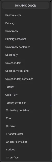
Dynamic Color dialog. Make selection above.
- The Custom color option (the first element in the dialog above) is the only interactive link in this demo. In the app, this function allows the user to define a specific, static color (Hex code) for the selected object. Using this option overrides the Material You dynamic roles, meaning the object's color will remain static and will not update when the device wallpaper changes.
For a setup to use Dynamic Color, the user must “authorize” it:
Main Menu > Launcher options > UI & Animation > Dynamic color scheme > 
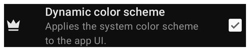
Dynamic Color, based on Android's Material You design language, adapts the Launcher’s color palette based on the user's wallpaper or theme. It uses predefined roles (like “Primary,” “Secondary,” “Error”) to apply consistent colors across different UI elements.
Note on this Demo: Since this wiki cannot detect the actual phone wallpaper, it is not possible to visually demonstrate the color changing in real-time.
- If you have a Green wallpaper, selecting “Primary” makes the object Green.
- If you have a Black/White wallpaper, “Primary” makes the object Black or White.
Color Roles Explained
Remember: Any settings made here apply only to the object currently modifying.
| Color Role Name | Description | Associated Role Name (mostly text on objects) | Description |
|---|---|---|---|
| Custom color | Allows the user to define a specific, static color (Hex code) for the selected object. Using this option overrides the Material You dynamic roles, meaning the object's color will remain static and will not update when the device wallpaper changes. | - | - |
| Primary | The main accent color. Used for key buttons or highlights. | On primary | Text/icons placed on top of a primary background (high contrast). |
| Primary container | A softer background variant for cards or panels. | On primary container | Text/icons on top of the primary container. |
| Secondary | Supporting accent color for less-prominent elements. | On Secondary | Text/icons on top of secondary backgrounds. |
| Secondary Container | A lighter version of secondary used for secondary cards or panels. | On Secondary Container | Text/icons on top of the secondary container. |
| Tertiary | A third accent color for subtle details. | On Tertiary | Text/icons on top of the tertiary container. |
| Tertiary Container | This is a lighter version of tertiary used for background of tertiary objects. | On tertiary container | Text/icons on top of the tertiary container. |
| Error | Used for alerts (usually Red). | On error | Text/icon color over error backgrounds |
| Error container | Text/icons on top of error backgrounds. | On error container | Text/icons on top of the error container. |
| Surface | The default background color for cards or pages. | On surface | Text/icons on top of the surface backgrounds. |
Usage Tips:
- Contrast: The “On…” roles ensure visibility. If your background is dark, the “On…” color will be light.
- Consistency: Using these roles ensures a theme looks good even if the wallpaper changes.
Automatic vs Manual Control
Total Launcher allows for a mix of automatic and manual control:
- Automatic: Total Launcher pulls a palette from the wallpaper and assigns it to the roles (Primary, Secondary, etc.).
- Manual Override: This will override any specific color role. For example, “Error” could be forced to always be Blue, even if the wallpaper is Red.
- To do this, use the Color Picker on that specific color role.
See more discussion at:
===== Hidden Index Anchors ===== ui-graphic-selection-phone_green_sq-group-option-edit-background-custom_color
Comments & Feedback
Toby Lancer is ready to help! Look for the Quick Help form:
► Desktop: left sidebar located near the bottom for Private to Admin
► Mobile: 3-bar menu at page top.
► Use the Discussion section below to share any experiences and communications with other Total Launcher users.
► Any Registered User can directly update this and any wiki page if desired.
Moderation: To keep the manual clean, all comments are held for appropriateness review. Preview any comment before submitting it. It will not be displayed after submission until it is reviewed. So, please, do not resubmit.
Formatting: If using any code snippets, place them inside code tags (e.g., 'code') using double single quotes (') before and after to keep them readable.
Be Kind: This is a community effort. Please keep feedback constructive and on topic.
~~DISCUSSION~~