meta data for this page
Color Picker
Dialog selections are discussed below the image. To navigate to an item, select it in the [insert] image. If NOT selecting any item and wanting to return to the prior page: swipe right-to-left; use the browser’s ‘back’ arrow, or use the Wiki’s Backlink icon on the right sidebar (mobile: drop-down dialog at the top of the page).
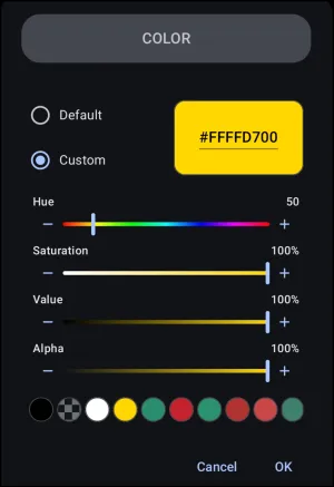
Color Picker dialog. There are no clickable selections above. Review the descriptions below, and then to navigate, use the browser left-to-right swipe or left sidebar to visit pages to return to the prior page
Interface Elements
- Mode Selection: - Radio buttons to choose between:
- Default: Offers standardized colors.
- Custom: Enables manual color adjustments to achieve the desired color.
- Hexadecimal Display/Input: - A highlighted box displaying the current color code in an 8-character format (e.g.,
#FFFFD700). The first two characters represent the Alpha channel, while the remaining six represent the RGB values. This box allows for direct text input by tapping it.
- Hue Slider: - A rainbow-gradient slider used to select the base color tone. Values range numerically.
- Saturation Slider: - Adjusts the intensity or purity of the color, ranging from 0% (grayscale with pigment stripped away) to 100% (full color).
- Value Slider: - Adjusts the brightness or luminance of the color, ranging from 0% (black) to 100% (full brightness).
- Alpha Slider: - Controls the transparency level, ranging from 0% (fully transparent) to 100% (fully solid and opaque).
- Recent Colors Palette: - A horizontal row of circular swatches displaying recently used colors. To copy a color from an existing element, open the Color Picker for that element and select
OK. The color will be added to the front of this palette for future access.- Default mode: Standardized colors. Swatches with a checkerboard pattern provide immediate visual confirmation that the selection is semi-transparent, guaranteeing that background layers will bleed through.
- Custom mode: When a custom color is finalized by selecting OK, the utility automatically pushes that exact configuration into this row, eliminating the need to repeatedly copy and paste hex codes when matching multiple elements across different interface pages.
- Cancel: Discard the selection.
- OK: Confirm the selection.
Optimal Workflow for Real Use
- Iinitial adjustments should bypass the Hue slider
- Advance the Value slider to 100% (restores full illumination)
- Advance the Saturation slider to 100% (restores full pigment intensity
- Allows the user to view the vivid color track before adjusting the Hue slider or reducing levels to achieve exact pastel, deep tone, or shaded variations.
For more explanation of alpha hex and percentages,


How to Pinpoint Specific Colors for Total Launcher's Color Picker Utility
There are many methods available, but two are offered here for their ease of use:
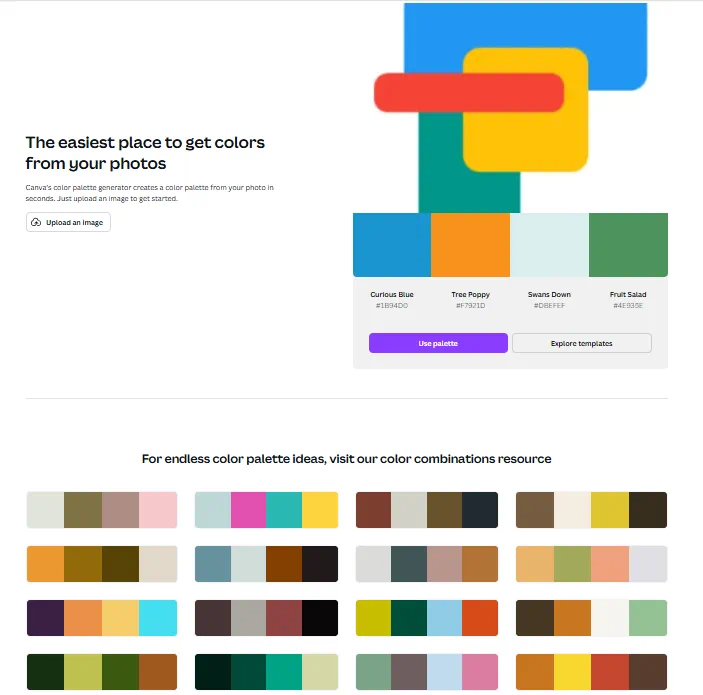
- If a digital image is available:
- Using a non-digital image (photo, magazine, device screen, etc.):
- Utilize a dedicated Android color picker application to extract hexadecimal codes. This does require an Android app: Color Picker by Mikhail Gribanov, which is available on the Google Play Store.
wrap hide>
Hidden Index Anchors
</wrap>
Comments & Feedback
Toby Lancer is ready to help! Look for the Quick Help form:
► Desktop: left sidebar located near the bottom for Private to Admin
► Mobile: 3-bar menu at page top.
► Use the Discussion section below to share any experiences and communications with other Total Launcher users.
► Any Registered User can directly update this and any wiki page if desired.
Moderation: To keep the manual clean, all comments are held for appropriateness review. Preview any comment before submitting it. It will not be displayed after submission until it is reviewed. So, please, do not resubmit.
Formatting: If using any code snippets, place them inside code tags (e.g., 'code') using double single quotes (') before and after to keep them readable.
Be Kind: This is a community effort. Please keep feedback constructive and on topic.
~~DISCUSSION~~