meta data for this page
Layout Options - List
This is a LONG dialog. Selections are discussed below the image. To navigate to an item, select it in the Layout List Options image.
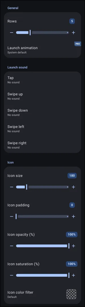
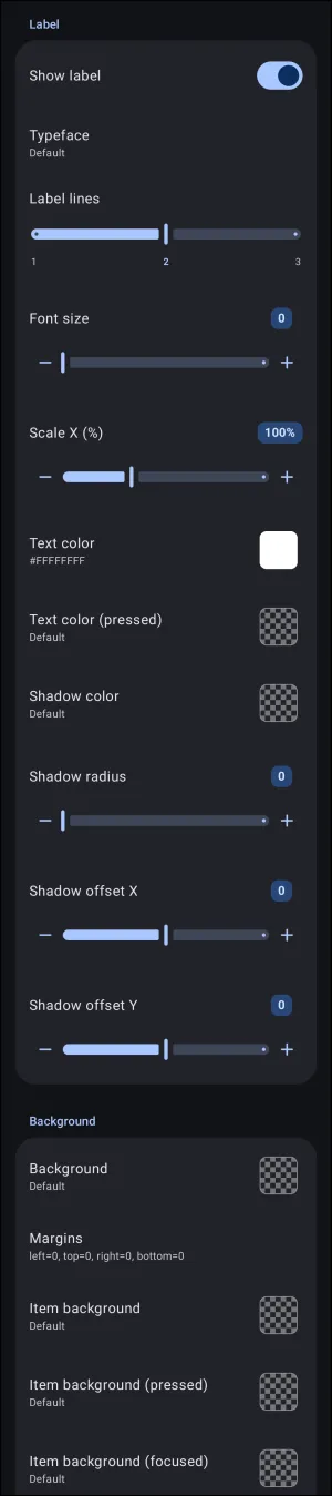
Layout Options - List dialog. Make selection above.
Layout Options - List
Dialog selections are discussed below the images. To navigate to an item, select it in the List Layout Options images.
The Layout Options - List dialog configures spatial dimensions, sound behaviors, typography, and container backgrounds for vertical linear layouts:
- General:
- Rows: Defines the number of visible item rows displayed simultaneously within the container boundaries (default is 5; range is 1 to 16). Scrolling reveals additional rows.
- Launch animation (PRO): Sets the visual transition animation triggered when launching an item from the list (defaults to
System default).
- Launch sound: Assigns sound effects to specific touch and directional gestures performed on any item within the layout.
- Tap: Audio file played upon a single tap interaction.
- Swipe up / Swipe down: Audio files triggered by upward or downward vertical swipes.
- Swipe left / Swipe right: Audio files triggered by horizontal swipes across list items.
- Icon: Controls global sizing, spacing, and color styling for all item icons within the list.
- Icon size: Scales the display dimensions of the icons. Range is 10 to 860, with a default of 180.
- Icon padding: Adjusts internal padding surrounding each icon within its bounding box. Range is 0 to 215, with a default of 0.
- Icon opacity (%): Sets global transparency for all icons. Range is 0% (fully transparent) to 100% (default, fully visible).
- Icon saturation (%): Adjusts color intensity from grayscale (0%) to full color (100% default).
- Icon color filter: Applies a uniform color tint overlay across all contained icons using the Launcher's dynamic color scheme (if activated) or the Color Picker utility for user-selected shades.
- Label & Shadow: Controls typography, line clamping, and text contrast.
- Show label: Master toggle to enable or disable text label visibility.
- Typeface: Selects the font family applied from the user device to all labels in the list.
- Label lines: Sets the maximum permitted text lines (1 to 3) before truncating.
- Font size: Adjusts label point size (0 uses the global theme default).
- Font size: Controls label text size. Range is 0 to 115.
- The size defaults to
0for a dynamic auto-fit; it automatically calculates font scale based on available row height (rendering equivalent to approximately60on standard layouts). 1to59enforces a smaller, fixed point size below the standard auto-fit baseline.61to115enforces a fixed, enlarged point size above the standard baseline.
- Scale X (%): Horizontally compresses or expands label text (50% to 200%).
- Text color / Text color (pressed): Defines resting and active-tap colors using the Launcher's dynamic color scheme (if activated) or the Color Picker utility using hex numbers (e.g.,
#FFFFFFFF). - Shadow color / Shadow radius: Configures blur radius and hue for underlying text drop shadows. More complete discussion on shadows and radius can be found at the Resource - Shadow] and [[section:section-shadow-radius-technical|Shadow Radius sections.
- Shadow offset X / Shadow offset Y: Shifts drop shadow position horizontally (X) and vertically (Y).
- Background: Controls container-level and item-level surface backgrounds.
- Background: Sets the fill color, gradient, or image resource for the entire list container.
- Margins: Defines outer border spacing (left, top, right, bottom).
- Item background: Resting background visual for each individual list item row.
- Item background (pressed): Background appearance displayed while an item is being tapped.
- Item background (focused): Visual state displayed when an item is selected via hardware keys or focus controls. This is key when D-Pads, keyboards, Android accessibility tools, or other rotary and stylus/cursor navigation items are used.
===== Hidden Index Anchors ===== ui-option-action_tap-launch_animation ui-resource-sound ui-option-icon_color_filter ui-launcher_options-resources-typeface ui-option-text_color ui-option-text_color_pressed ID4 ui-generic-background ID6 ui-option-item_background ui-option-item_background_pressed ui-option-item_background_focused

Comments & Feedback
Toby Lancer is ready to help! Look for the Quick Help form:
► Desktop: left sidebar located near the bottom for Private to Admin
► Mobile: 3-bar menu at page top.
► Use the Discussion section below to share any experiences and communications with other Total Launcher users.
► Any Registered User can directly update this and any wiki page if desired.
Moderation: To keep the manual clean, all comments are held for appropriateness review. Preview any comment before submitting it. It will not be displayed after submission until it is reviewed. So, please, do not resubmit.
Formatting: If using any code snippets, place them inside code tags (e.g., 'code') using double single quotes (') before and after to keep them readable.
Be Kind: This is a community effort. Please keep feedback constructive and on topic.
~~DISCUSSION~~