meta data for this page
<!-- googleoff: index -->
⚠️ v4.0 UI Transition Notice - In Process: The release of Total Launcher v4.0 has introduced significant user interface changes. Please note that this page does not yet reflect these updates. The new layout paths, folds, and visual maps are currently being compiled and will be deployed shortly.
<!-- googleon: index -->
Note: The image below is a static preview and contains no clickable dialogs. To navigate away after reviewing:
- Go Back: Return to the Widget Select page or use the browser's back arrow (swipe right-to-left).
- Explore: Choose a new topic from the left sidebar menu.
Widget: Application
The Application Widget serves as a container for third-party widgets provided by other apps installed on the user's device (e.g., Weather, Calendar, Music Player). Total Launcher extracts these standard Android views for placement by the user in the setup.
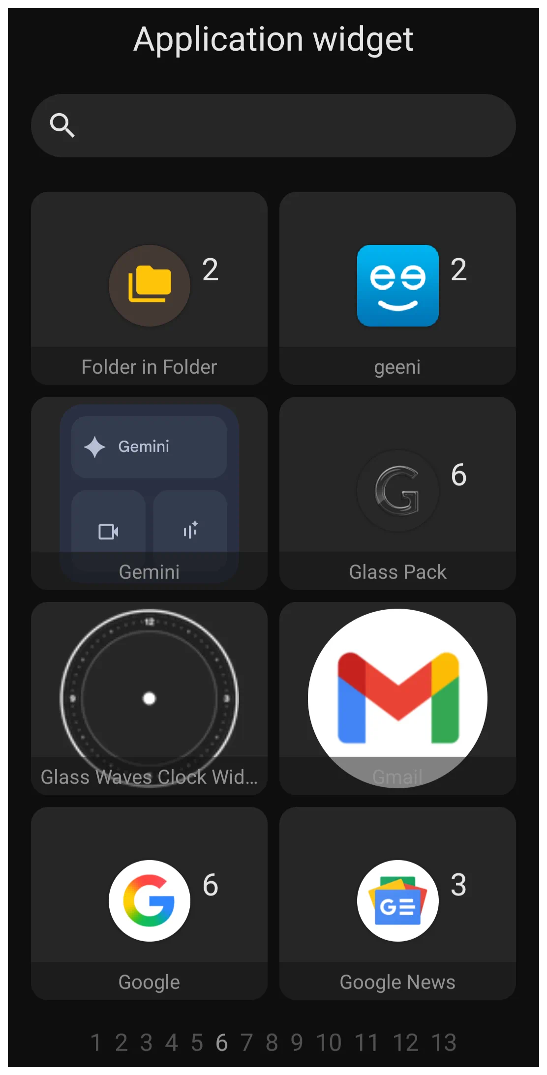 | The image shows Page 6 of 13 of the application widgets on the device used to capture the image. It is shown to provide the reader with sample view the application widget dialog. These application widgets may not be on any user's device. A user's device will only show a list of application widgets installed on their device. |
Android application developers will encode widget containers for specialized data display setups for their applications. When these are available, with the application Total Launcher extracts and displays each in the application widget dialog for the user to select and install on a page, drawer, or window.
Each application widget developer provides customization opportunities for their respective widgets. However, Total Launcher, in managing an application widget, focuses on the visual presentation of the wrapper container. The dialog for the application widget Option Edit is shown below
 |
- Rounded corner radius - The widget's container defaults to a square but can be resized by tap-holding and grabbing a container corner. The user can choose to have corners rounded by selecting the desired radius, with a range of 0 (default for the original widget) to 575 (which can be a horizontal pill, circle, or vertical pill depending on how the widget container is sized).
- Opacity - This allows the user to control how much transparency is applied when viewing the underlying content, in this case, the application widget. The launcher option provides a slider from 0 (opaque, with container content fully blocked) to 100 (fully transparent). This option will apply the effect to the entire widget container, meaning overall colors will be fully visible (100), muted (50), or the content blocked (0). Most likely, meaningful use of this option would be in combination with either the background option of color or dynamic color to provide a tonal quality to the widget container
- Widget settings - This dialog appears for any Application Widget. However, it can only be activated by a user if the application developer has enabled the configuration feature. It will not work on every application widget, as shown with the notification in the image below.
 |
- Background - Defines the background of the widget container. For complete discussion on background see Background.
- Margins: Allows adjustment of the margins surrounding the widget in its container. For complete discussion on setting margins, see Understanding Margins in Total Launcher.
It is critical to remember that Total Launcher only saves the “Application Widget” placeholder on the page or window, not the 3rd-party widget's internal settings. When a backup is restored, the user will be responsible for returning to the application widget location, tapping its placeholder to initiate its reinstallation, and then reapply the application widget's settings.
Scaling vs. Resizing
There is a functional difference between resizing and scaling a widget in how they affect the widget's background size. Resizing the widget frame (dragging the corner handles) changes the container size, but the content inside does not automatically stretch to fill the new space. If the widget content appears too small or floats in empty space after resizing, use the rotate-transform icon  (then tap its
 Transform button and use the top slider [10-100]) to zoom the widget with its contents, which will not change the background size.
- Resize - Changes the boundaries of the container.
- Scale - Zooms the widget content and its container (background).
Many third-party widgets come with built-in, non-removable padding. Total Launcher's object negative margin may “crop” this outer space, which is useful for achieving perfectly rounded corners that hug the widget's actual content.
Interaction Handling
Application widgets retain their native functionality. If a widget contains a scrollable list (such as a generic RSS reader or Calendar), it will intercept touch events. Swiping directly on the widget will scroll the list content rather than swiping the launcher page.
Limitations of App Widget Backup & Restore
It is critical to remember that Total Launcher only saves the placeholder for Application Widgets, not the widget or its internal settings when a backup is made.
When restoring a backup, the specific configuration of the third-party widget (e.g., the specific city in a weather widget or the account in a mail widget) is not restored. The user must tap the placeholder to reinitialize the widget and manually reapply its internal settings unless the widget's developer has provided a save-setting or restore feature.
Widget Not Updating?
If a widget (such as a Clock or Battery monitor) lags or stops updating, the issue is usually with the Android System, not the launcher. Go to the device's Android Settings > Apps, locate the app that provides the widget, and ensure it is excluded from the device's “Battery Optimization” or “Deep Sleep” features.
Comments & Feedback
Toby Lancer is ready to help! Look for the Quick Help form:
► Desktop: left sidebar located near the bottom for Private to Admin
► Mobile: 3-bar menu at page top.
► Use the Discussion section below to share any experiences and communications with other Total Launcher users.
► Any Registered User can directly update this and any wiki page if desired.
Moderation: To keep the manual clean, all comments are held for appropriateness review. Preview any comment before submitting it. It will not be displayed after submission until it is reviewed. So, please, do not resubmit.
Formatting: If using any code snippets, place them inside code tags (e.g., 'code') using double single quotes (') before and after to keep them readable.
Be Kind: This is a community effort. Please keep feedback constructive and on topic.
~~DISCUSSION~~