meta data for this page
Resources
Dialog selections are discussed below the image. To navigate to an item, select it in the Resources dialog image. If NOT selecting any item and wanting to return to the prior page: swipe right-to-left; use the browser’s ‘back’ arrow, or use the Wiki’s Backlink  icon on the right sidebar (mobile: drop-down dialog at the top of the page).
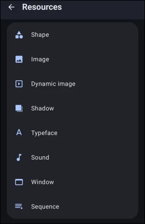
Resources dialog. Make selection above.
This dialog screen shows options for:
- Shape - Used for creating scalable UI elements, background containers, and custom button bases; these vector shapes utilize mathematical rendering to maintain perfect clarity at any screen resolution while consuming minimal system memory.
- Image - Used to incorporate static raster graphics into the interface layout. Select the designated local image file to apply as an icon, widget background, or structural decoration.
- Dynamic image - Used to display graphics that automatically change based on system states. Determine the appropriate system variable, such as
$battery_levelor media playback status, to dynamically synchronize the visual output. - Shadow - Shadows for an object, whether it is text or other graphics such as images, shapes, icons, windows, or folders, serve as a fundamental visual anchor that provides a three-dimensional lift to complement a professional interface. By creating a separation between the object and its background, the user's eye easily distinguishes what is interactive and what is static.
- Typeface - Typefaces are used across app labels, widgets, and custom text objects. Select the desired local font file to apply uniform typographic styling across the Launcher design.
- Sound - Used to assign audio feedback to interface interactions. Select the desired local audio file to play during specified trigger events, ensuring auditory confirmation of actions.
- Window - Often used as a substitute for “pages” as custom pop-up panels. Determine the precise layout, dimensions, and contents of these floating containers to organize tools without overwhelming the main interface.
- Sequence - Used to execute complex, multi-step automated actions. Used to determine the exact order of internal operations required to perform sequential commands from a single interaction.
===== Hidden Index Anchors ===== ui-launcher_options-resources-shape ui-launcher_options-resources-image ui-launcher_options-resources-dynamic_image ui-launcher_options-resources-shadow ui-launcher_options-resources-typeface ui-launcher_options-resources-sound ui-launcher_options-resources-window ui-launcher_options-resources-sequence
Comments & Feedback
Toby Lancer is ready to help! Look for the Quick Help form:
► Desktop: left sidebar located near the bottom for Private to Admin
► Mobile: 3-bar menu at page top.
► Use the Discussion section below to share any experiences and communications with other Total Launcher users.
► Any Registered User can directly update this and any wiki page if desired.
Moderation: To keep the manual clean, all comments are held for appropriateness review. Preview any comment before submitting it. It will not be displayed after submission until it is reviewed. So, please, do not resubmit.
Formatting: If using any code snippets, place them inside code tags (e.g., 'code') using double single quotes (') before and after to keep them readable.
Be Kind: This is a community effort. Please keep feedback constructive and on topic.
~~DISCUSSION~~