meta data for this page
<!-- googleoff: index -->
⚠️ v4.0 UI Transition Notice - In Process: The release of Total Launcher v4.0 has introduced significant user interface changes. Please note that this page does not yet reflect these updates. The new layout paths, folds, and visual maps are currently being compiled and will be deployed shortly.
<!-- googleon: index -->
ui-graphic-selection-text-built_in-edit <previous page>
Graphic Text Built-ins
Dialog selections are discussed below the image. There is no customary navigation for an item in this image. After viewing the image and the content beside it a further explanation of the components of these mixed graphics is shown below.
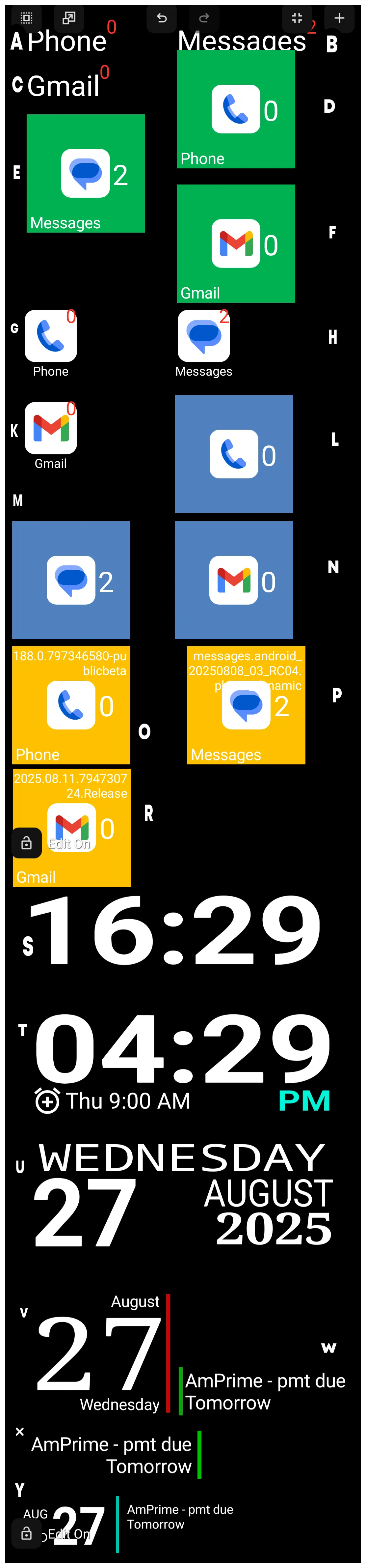
| IDENTIFIER | TYPE | DESCRIPTION |
|---|---|---|
| A | Mixed | phone with new notification count |
| B | Mixed | messages with new notification count |
| C | Mixed | Gmail with new notification count |
| D | Mixed | Rectangle green with phone Image with new notification count and text |
| E | Mixed | Rectangle green with messages image with new notification count and text |
| F | Mixed | Rectangle green with Gmail image with new notification count and text |
| G | Mixed | phone application with image with new notification count and text |
| H | Mixed | messages application with image with new notification count and text |
| K | Mixed | text application with image with new notification count and text |
| L | Mixed | Rectangle blue with phone image and new notification count |
| M | Mixed | Rectangle blue with messages image and new notification count on right |
| N | Mixed | Rectangle blue with Gmail image and new notification count |
| O | Mixed | Rectangle yellow with phone image / application version / new notification count and text |
| P | Mixed | Rectangle yellow with messages image / application version / new notification count and text |
| R | Mixed | Rectangle yellow with Gmail image / application version / new notification count and text |
| S | Text | current 24-hr time |
| T | Mixed | current 12-hr time with next event |
| U | Mixed | day / date / month / year |
| V | Mixed | month / date / day with right red vertical |
| W | Mixed | left green vertical with next event and day |
| X | Mixed | next event and day with green vertical on right |
| Y | Mixed | vertical month/day/date with green vertical and next event with day |
When selecting “text” the user must decide what action if any the “text” will activate.
This image above shows the landing spot (a page) when the user selects almost all of the built-in graphics. The complete list of built-in graphics was shown on the previous ui screen. The exceptions not shown here are:
which are objects unto themselves … these are not mixed, but self-contained. Their initial landing spot, as shown if the link is selected is the Action dialog where a selection must be made to link either to an categorical action (application, window, folder, launcher action, or sequence) or to default (no action).
Each mixed object shown in the image above has 2 or more of these elements:
- Text
- Image
- Notification count
- Date/Time
- Day
- Month
- Year
- Calendar event
These are placed relative to each other then grouped to bind them into a “single” object which is more easily preserved when moved during the design phase.
Samples of the above mixed graphics are shown below. Tapping the image will display the pages with the dialogs for the elements contained in the mixed graphic. This will be useful in understanding how this objects are compiled which could assist a user in creating new ones … including custom widgets.
| A - Mixed - phone with new notification count 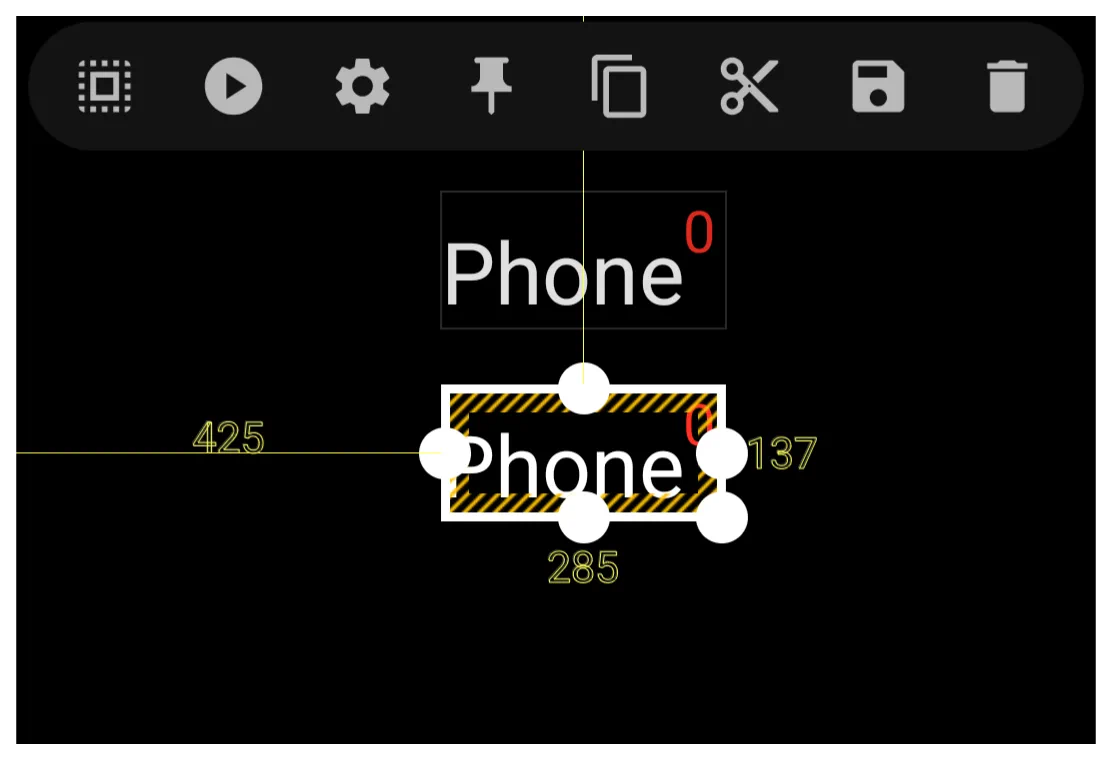 Click Here |
Examples of the built-in graphic objects and their elements as shown in their “edit” dialog is offered below as a learning example:
Tap-on-Action Dialog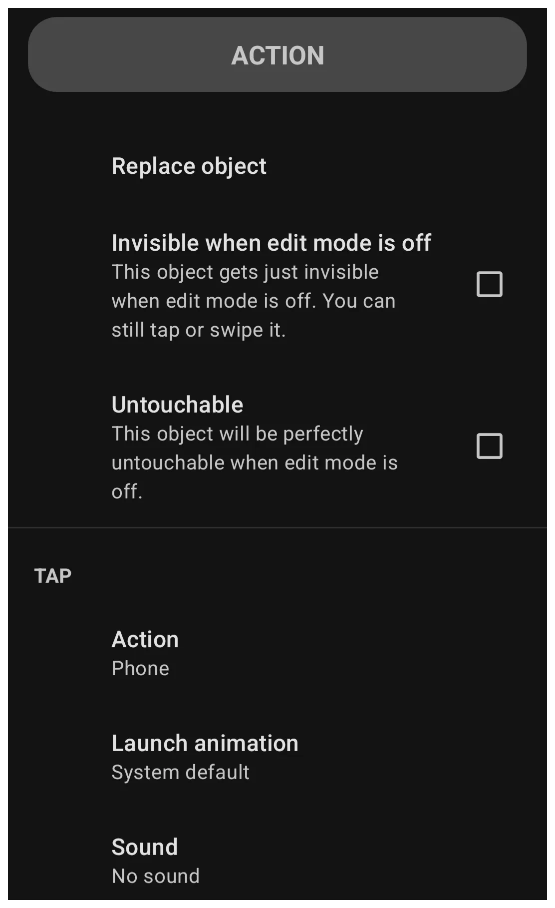 | Edit Dialog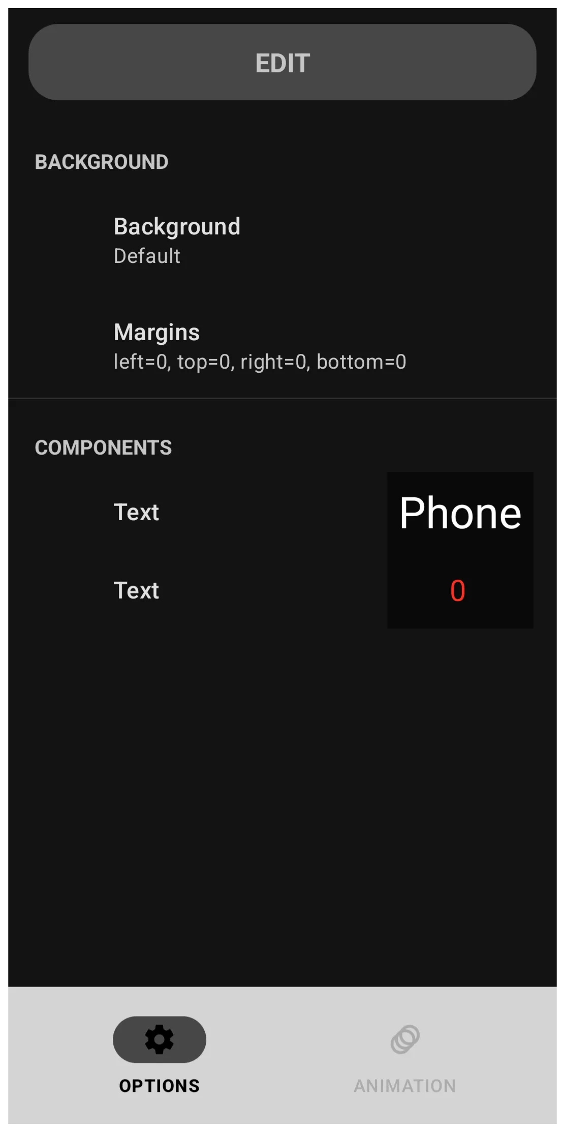 | Background Dialog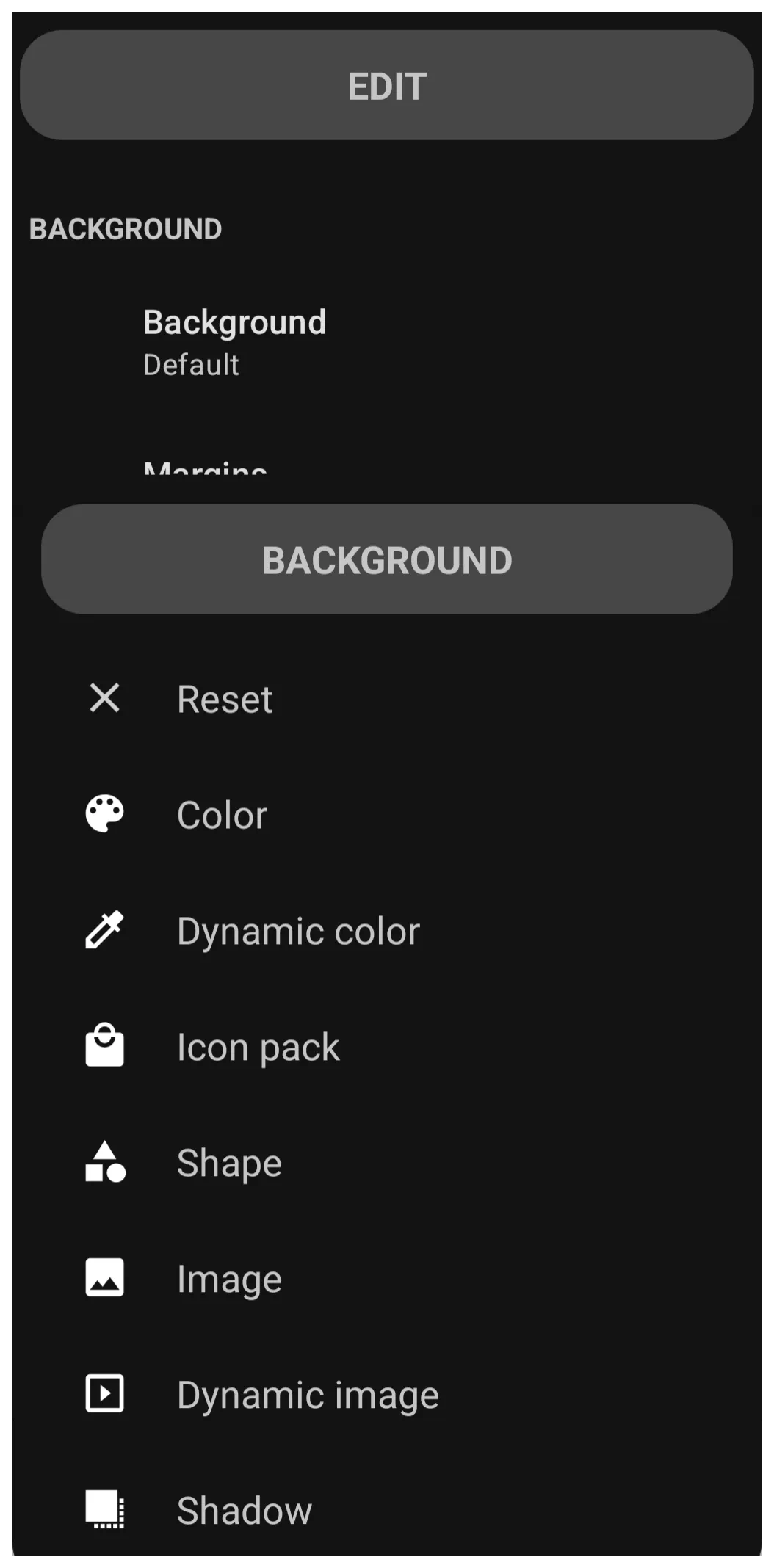 |
 | Margins Dialog |
Comments & Feedback
Toby Lancer is ready to help! Look for the Quick Help form:
► Desktop: left sidebar located near the bottom for Private to Admin
► Mobile: 3-bar menu at page top.
► Use the Discussion section below to share any experiences and communications with other Total Launcher users.
► Any Registered User can directly update this and any wiki page if desired.
Moderation: To keep the manual clean, all comments are held for appropriateness review. Preview any comment before submitting it. It will not be displayed after submission until it is reviewed. So, please, do not resubmit.
Formatting: If using any code snippets, place them inside code tags (e.g., 'code') using double single quotes (') before and after to keep them readable.
Be Kind: This is a community effort. Please keep feedback constructive and on topic.
~~DISCUSSION~~