meta data for this page
Resource - Dynamic Image
Dynamic Image Resources in Total Launcher provide responsive visual assets that change automatically based on system states, sensor inputs, live data feeds, or manual triggers. Unlike static raster images that remain unchanged, dynamic images evaluate internal system conditions (such as battery levels, active network states, live weather, music playback, or dynamic calendar dates) to display appropriate icon states, gauges, and multi-layer graphics in real time.
Saved directly within the central resource library (Resources - Dynamic Image), dynamic images can be shared across multiple objects, pages, and widgets, updating globally whenever resource properties are refined.
What is a Dynamic Image Resource?
Total Launcher organizes all active and user-created dynamic visual elements within a central manager accessed via:
- Location: Enter
Edit Mode>Launcher options>Resources>Dynamic image
Common Use Cases
- System Status Gauges: Rendering battery levels, CPU load, RAM consumption, and storage capacity as visual needles, progress bars, or progressive dials.
- Live Weather Icons: Displaying context-aware weather condition art that updates with forecast data and day/night cycles.
- Interactive Toggles: Illustrating connection states (Wi-Fi, Bluetooth, Airplane mode, Torch) with distinctive active and inactive icon sets.
- Live Calendar & Clock Components: Displaying dynamic day-of-the-month badges, rotating analog clock hands, and moon phase indicators.

Two additional Launcher dialogs reveal the user interface when designing with dynamic images:
| Add dialog: Mobile Data | Type dialog for all Dynamic Images |
|---|---|
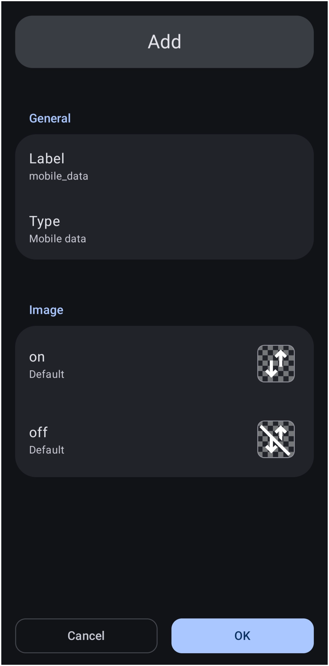 | 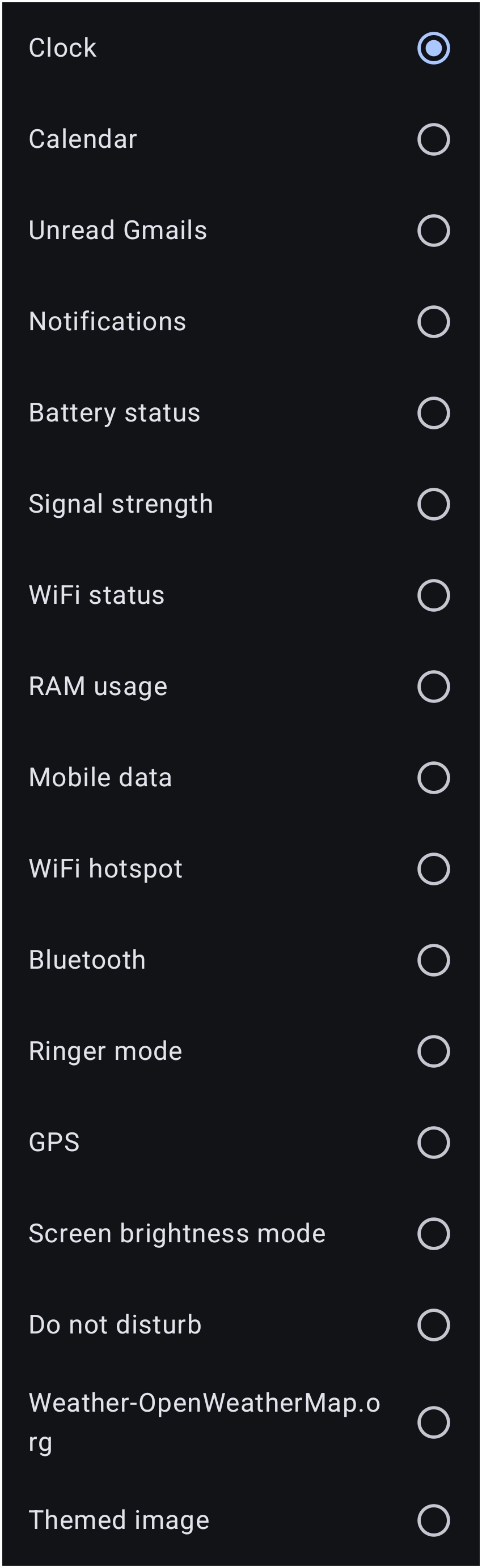 |
Location: Edit On > Add > Graphic >Image > Default > Dynamic image > Add | Location: Select Type in the previous image location |
Dynamic Image Library & Screen Ratio Profiles
The top tab bar categorizes existing assets and lets the canvas aspect ratios be managed across varying device displays:
| Tab / Control | Functional Role | Description |
|---|---|---|
| Search (Magnifier) | Quick Filter | Enter a search string to instantly locate specific user-created or built-in dynamic images. |
| Added | User & Theme Library | Displays all dynamic image templates currently created, customized, or used in the setup. |
| Ratio Tabs (e.g. 16:9, 19.5:9) | Screen Resolution Presets | Represents proportional grid dimensions (such as standard 16:9 for 1080×2400) to ensure gauges and graphics scale accurately without geometric distortion. |
| Add (+) | Create / Template Picker | Opens the built-in dynamic image catalog to build a new graphic from system presets or scratch. |
Aspect Ratio Tip:
When designing setups for multi-screen foldables, flip devices, or tablets, test dynamic images across aspect ratios (such as 22.5:18 for Fold screens or 5:8 for tablets) to prevent dial hands and radial gauges from skewing off-center.
Built-in Dynamic Image Categories
When creating a new dynamic image via the Add (+) button, Total Launcher provides pre-configured dynamic templates:
| Category (see image) | Dynamic Bindings | Common Display Styles |
|---|---|---|
| Battery | Charge percentage, charging state (AC/USB/Wireless), battery temperature, battery health | Radial gauge, linear bar, numeric charging icons, multi-state battery levels. |
| Date & Time | Hour, minute, second, day of the week, day of the month, month, AM/PM | Rotating analog hands (hour/min/sec), dynamic calendar tear-off badges. |
| Weather | Current condition code, temperature range, humidity, precipitation probability, day/night flag | Condition icon packs, dynamic moon phases, temperature thermometers. |
| Device & Hardware | Internal storage free/used, RAM memory usage, CPU load, cellular signal strength, Wi-Fi level | Step-fill meter bars, speedometer needles, multi-tier signal bars. |
| Media & Audio | Play/Pause state, track progress, volume level, Bluetooth audio connection | Dynamic playback buttons, rotating album vinyl rings, volume level meters. |
| Custom / Variable | User-defined launcher variables, Tasker broadcasts, custom numeric ranges | Multi-state image swaps controlled via custom integer or string thresholds. |
Core Dynamic Image Types
Total Launcher splits dynamic visual logic into three structural rendering modes:
Value-Based Multi-State Images
Multi-state images assign individual static image frames to specific numeric thresholds or boolean states.
- Discrete State Matching: Ideal for Wi-Fi signal strength (0 to 4 bars) or weather conditions (sunny, rainy, cloudy, snowy).
- State Mapping: Define a state table where
Value = XdisplaysImage X.
Analog Rotating Elements (Hands / Needles)
Transforms a single graphic into a pivot-based rotating indicator.
- Pivot Anchor: Sets the exact X/Y coordinate origin around which the image rotates (default is center `50%, 50%`).
- Angle Mapping: Maps minimum and maximum data values to specific angular degrees (e.g., Battery `0%` = `-120°`, Battery `100%` = `+120°`).
Linear and Radial Progress Gauges
Crops or sweeps an image layer progressively based on live percentage values.
- Linear Fill: Reveals a progress texture horizontally, vertically, or bidirectionally.
- Radial Sweep: Unmasks a circular ring clockwise or counter-clockwise from a custom start angle.
Step-by-Step Creation Workflows
Building a Dynamic Battery Level Ring
- Open
Edit Mode>Launcher options>Resources>Dynamic image. - Tap Add (+) and select Battery.
- Choose Radial Meter as the base style.
- Set the Start Angle to ` -90°` (12 o'clock position) and Sweep Angle to `360°`.
- Under Color / Texture, select a primary accent color or vector gradient.
- Name the label
battery_radial_ringand tap OK to save. - Apply this resource to any page object via
Object Options>Graphic Style>Image Resource.
Creating a Live Calendar Icon Badge
- Tap Add (+) in the Dynamic Image library and choose Date.
- Select Day of Month Badge.
- Assign a base background frame (e.g., a top-red calendar icon body).
- Configure the dynamic text overlay: set font family, alignment to center, and color to `#FF212121`.
- Save as
calendar_live_badge. The icon will automatically update its number daily at midnight without manual launcher reloads.
Resource Optimization Note: High-frequency dynamic elements (such as analog second hands updating every 1000ms) consume slightly more CPU cycles than minute-based updates. For maximum battery longevity, limit dynamic updates to 1-minute intervals where continuous seconds are unnecessary.
Benefits of Dynamic Image Resources
- Global Asset Synchronization: Editing a dynamic image within the central resource library instantly propagates changes across all widgets, app drawers, and layouts using that resource.
- Zero External Code Required: Complex sensor animations (such as analog gauges, battery indicators, and weather art) render natively within the launcher without requiring third-party widget engines.
- Tasker/MacroDroid & Automation Readiness: Dynamic images can listen to custom launcher string/integer variables updated via external Tasker/MacroDroid intents, allowing custom automation dashboards.
Also see the UI Section on Dynamic Images.
Comments & Feedback
Toby Lancer is ready to help! Look for the Quick Help form:
► Desktop: left sidebar located near the bottom for Private to Admin
► Mobile: 3-bar menu at page top.
► Use the Discussion section below to share any experiences and communications with other Total Launcher users.
► Any Registered User can directly update this and any wiki page if desired.
Moderation: To keep the manual clean, all comments are held for appropriateness review. Preview any comment before submitting it. It will not be displayed after submission until it is reviewed. So, please, do not resubmit.
Formatting: If using any code snippets, place them inside code tags (e.g., 'code') using double single quotes (') before and after to keep them readable.
Be Kind: This is a community effort. Please keep feedback constructive and on topic.
~~DISCUSSION~~