Table of Contents
Dynamic Color Dialog
Dialog selections are discussed below the image. To navigate to an item, select it in the [insert] image. If NOT selecting any item and wanting to return to the prior page: swipe right-to-left; use the browser’s ‘back’ arrow, or use the Wiki’s Backlink icon on the right sidebar (mobile: drop-down dialog at the top of the page).
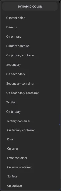
Dynamic Color dialog. Make selection above.
Dynamic Color, based on Android's Material You design language, adapts the Launcher’s color palette based on the user's wallpaper or theme. It uses predefinedroles, like “Primary,” “Secondary,” and “Error,” to apply consistent and visually appealing colors across different UI elements.
The options listed in the above Color - Dynamic Color image are further described below:
- Primary - The main accent color. Used for key buttons, highlights, or standout elements.
- On primary - Color used for text/icons placed on top of a primary background (usually high contrast, e.g., white/black).
- Primary container - A softer or lighter background variant of primary used for cards, panels, and grouped objects.
- On primary container - Text/icon color that appears on top of the primary container to be readable and well contrasted.
- Secondary - A supporting accent color, often used for less-prominent buttons and UI elements.
- On secondary - Text/icons on top of secondary backgrounds.
- Secondary container - A lighter version of secondary used for secondary cards or panels.
- On secondary container - Tex/icons on top of the secondary container.
- Tertiary - Tertiary (a third) accent color. This is less common but useful for subtle details.
- On tertiary - Text/icon on top of tertiary backgrounds.
- ** Tertiary container** - This is a lighter version of tertiary used for the background of tertiary objects.
- On tertiary container - Text/icons on top of the tertiary container.
- Error - Used for alerts/warning indicators (usually red).
- On error - Text/icon color over error backgrounds
- Error container - Text/icons on top of error backgrounds.
- On error container - Text/kcons on top of the error container.
- Surface - The default background color for most surfaces such as cards or pages.
- On surface - Text/icons on top of the surface backgrounds.
Keep these points in mind when using dynamic colors
- Customization - When designing a layout, assign these roles to widgets, panels, buttons, and text. For example, a weather widget might use “Primary Container” as its background and “On Primary Container” for the text.
- Contrast & Readability - The “On…” roles are carefully chosen to ensure visibility. If your background is dark, the “On…” color will likely be light (and vice versa).
- Consistency - Using these roles instead of manually picking colors helps maintain a cohesive look across your launcher—even if you change wallpapers.
- Error Handling - Assign “Error” and “On Error” roles to elements that show warnings or failed actions (e.g., failed sync, missing data).
Start with the default dynamic color setup and observe how colors shift with different wallpapers. Use containers, such as windows, to group related elements like a calendar panel or app folder. Experiment, preview changes instantly, then tweak.
Dynamic Color - Automatic vs Manual Control
Total Launcher’s Dynamic Color system, inspired by Android’s Material You, isn't locked in. There can be Automatic theming (based on wallpaper or system theme) and Manual overrides (for any individual color role)
- What Happens Automatically if Dynamic Color is enabled:
- Total Launcher pulls a color palette from the current wallpaper (or system theme if supported).
- It assigns colors to each role, Primary, Secondary, Tertiary, Error, Surface, based on Material You guidelines.
- These roles are then used across widgets, panels, buttons, and text if the user chooses Use Dynamic Color scheme for those objects.
- It is sort of a “set it and forget it”, and the Launcher harmonizes everything automatically.
- What You Can Customize Independently:
- The user can override any role manually if the wallpaper/theme supports it. For example:
- Want a custom red or blue for Error? It could be set directly.
- Each role has its own color picker for adjusting hue, saturation, and using hex codes for precision. This means that mix and match is possible: let most roles follow Dynamic Color, but tweak a few (like Error or Tertiary) for design purposes such as improving visibility.
===== Hidden Index Anchors ===== ID1|Primary@17,78,71,98 { } cfg
Comments & Feedback
Toby Lancer is ready to help! Look for the Quick Help form:
► Desktop: left sidebar located near the bottom for Private to Admin
► Mobile: 3-bar menu at page top.
► Use the Discussion section below to share any experiences and communications with other Total Launcher users.
► Any Registered User can directly update this and any wiki page if desired.
Moderation: To keep the manual clean, all comments are held for appropriateness review. Preview any comment before submitting it. It will not be displayed after submission until it is reviewed. So, please, do not resubmit.
Formatting: If using any code snippets, place them inside code tags (e.g., 'code') using double single quotes (') before and after to keep them readable.
Be Kind: This is a community effort. Please keep feedback constructive and on topic.
~~DISCUSSION~~